
// web design
If you believe simple is smart and writing should be accessible for everyone, you'll get along well with the team at Plainly Speaking. They're an award-winning communications firm with expertise in plain language, a style of writing that supports comprehension and accessibility (they're also a strategic partner to Xquisit and our personal friends). With English, French, and Spanish skills, the Plainly Speaking team helps companies look professional in all their written communications and bring brands to life through storytelling. They also offer coaching for businesses and workshops for subject-specific writing.
Plainly Speaking wanted a refreshed online presence to reflect their professionalism and experience in coaching, writing and branding.
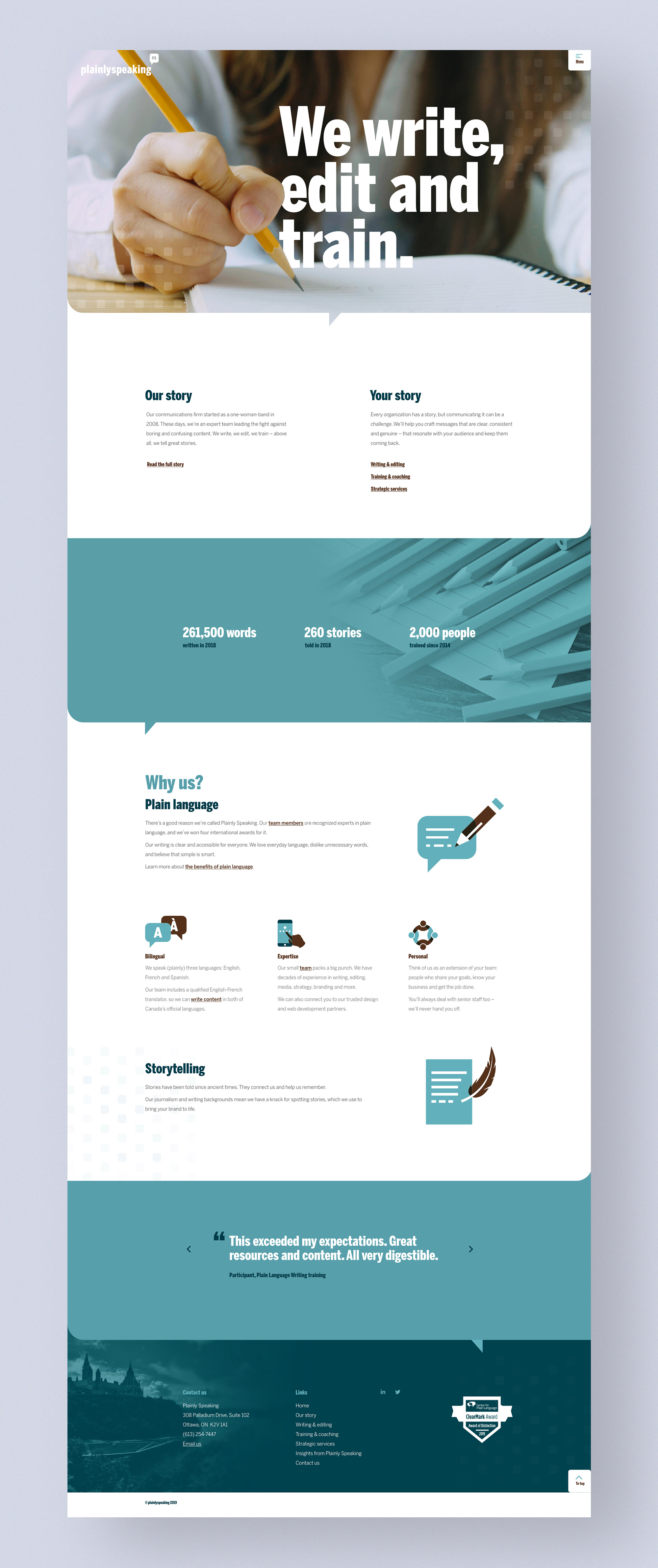
We began our design process by creating a site map that would serve as our guide for the navigation and user journey. Keeping the navigation within a sticky (always visible) hamburger menu, allowed for an uncluttered and inviting design while maintaining clear navigation and uninterrupted user experience.
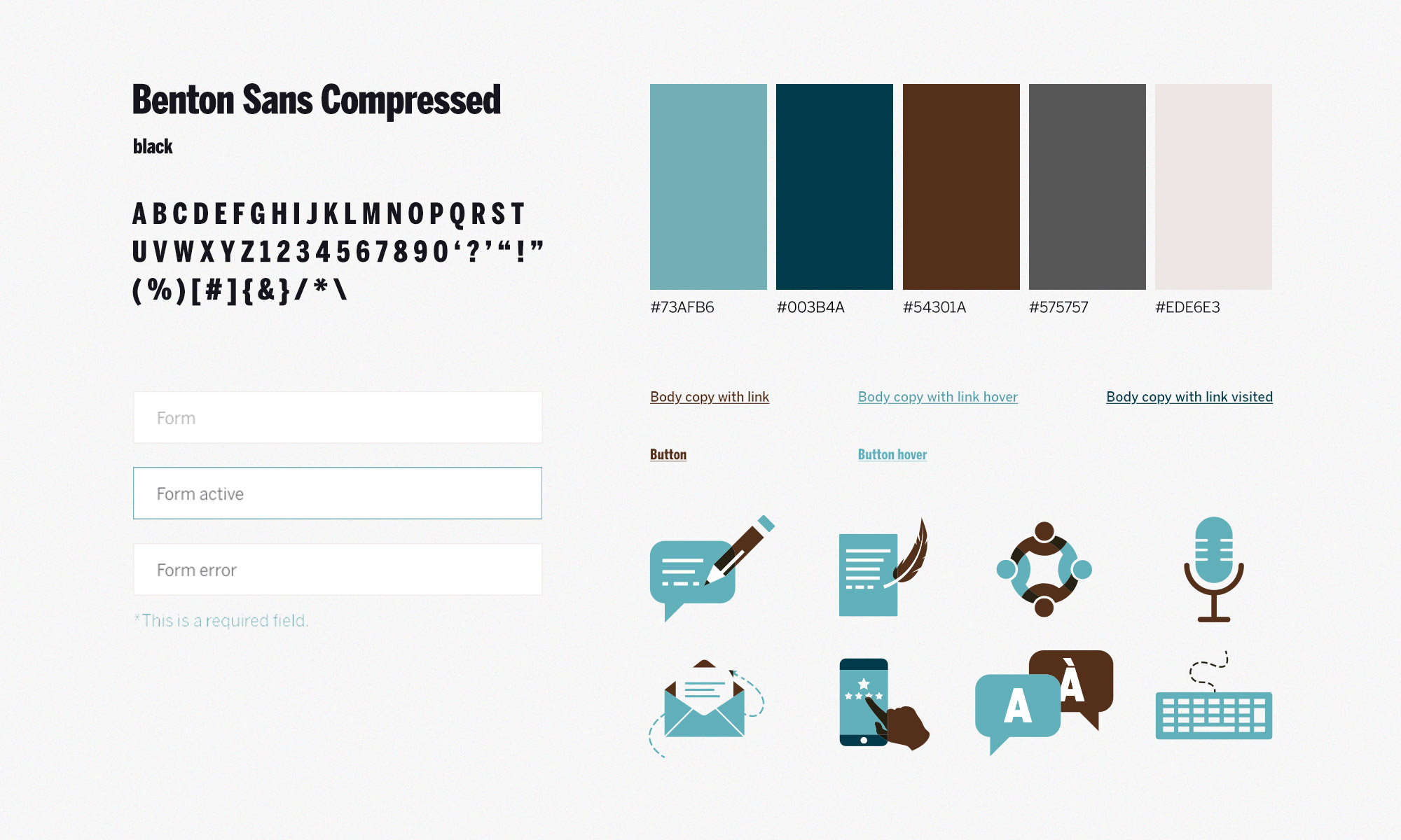
To develop the brand for the site and future collateral, we drew inspiration from the Plainly Speaking logo itself. We used their rounded square shape and speech mark as motifs and implemented them wherever appropriate. We designed rounded corners throughout the site, from the section breaks to the custom iconography.
Animated details in the menu, homepage stats, parallax (an animation where the background moves at a different speed than the foreground) and timeline sections extended the dynamic, elevated and custom qualities of the website.
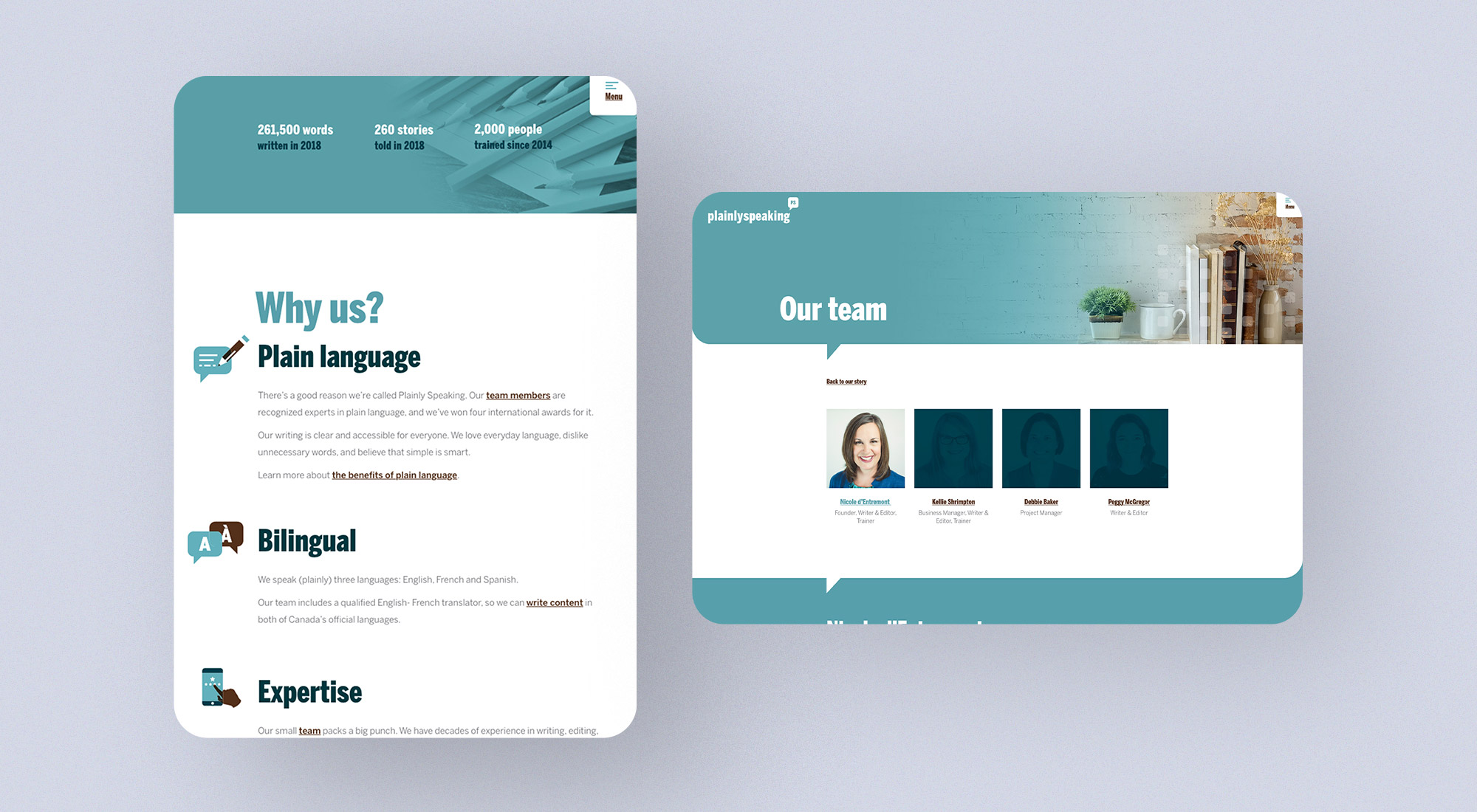
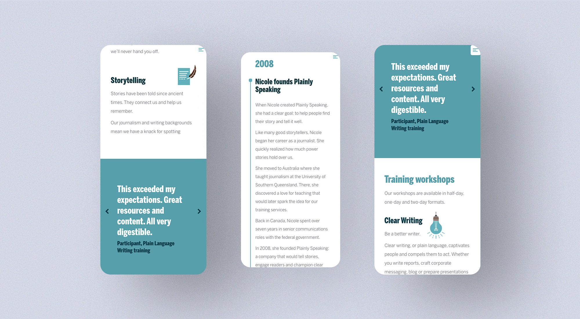
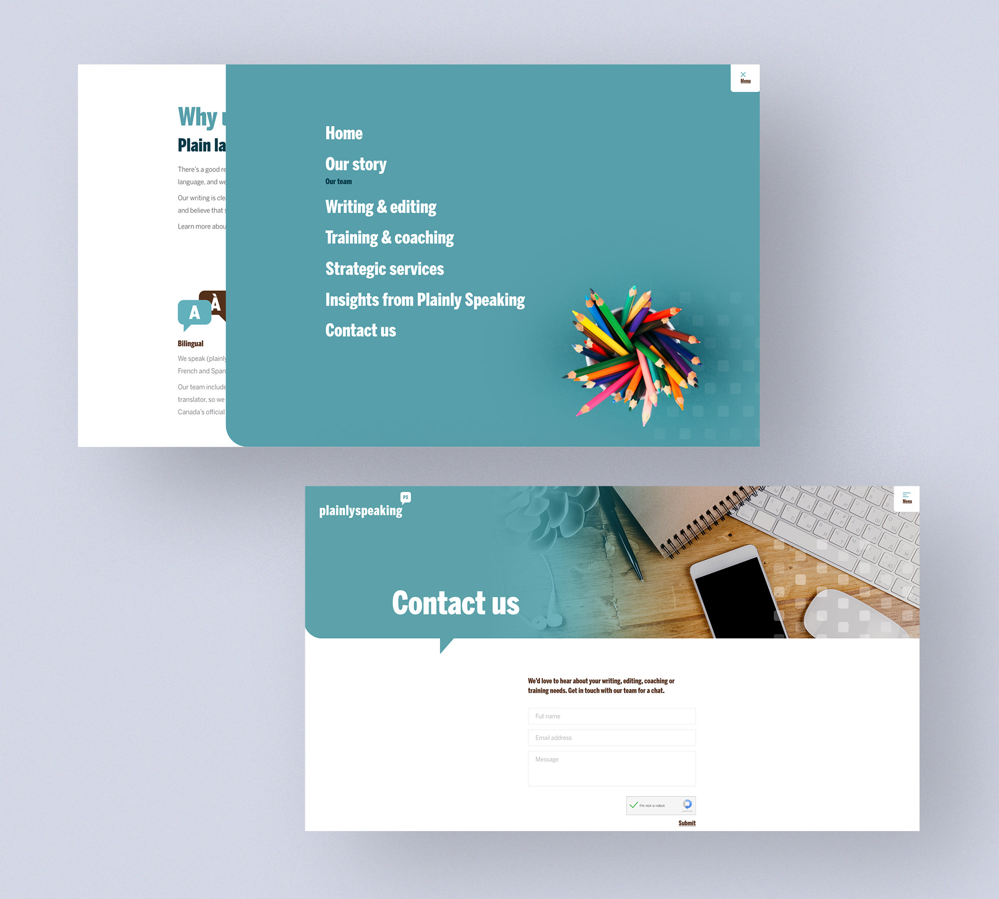
The Plainly Speaking website's goals were multi-faceted; it served as a branding piece and was also an example of the team's expertise writing web copy – a portfolio piece. For this reason, they wanted an easy to read, user-friendly layout and design that exceeded AODA compliance levels in terms of contrast and text size. The design needed to match their company philosophy of uncomplicated, accessible content, and, above all, needed to highlight their writing. We implemented a clear type hierarchy, an appropriate amount of colour contrast, adequate spacing between paragraphs and between lines of text, and clear differentiation between what was interactive and what was not.
Plainly Speaking's website showcases the company's professionalism and expertise in writing and coaching, and the honest, friendly nature of their team. It highlights the unique aspects of their brand and allows the skillfully written copy to take centre stage.