
// serial publication design
The Foundation for Student Science and Technology is a non-profit organization dedicated to providing enterprising students with an opportunity to connect or share ideas with individuals and professionals across the scientific community. They also foster an environment to develop their careers and improve their chances of success.
The Foundation reached out to us to help redesign their long-running publication, the Journal of Student Science and Technology. It’s a multidisciplinary, peer-reviewed publication that provides an outlet for students to publish their work and research.
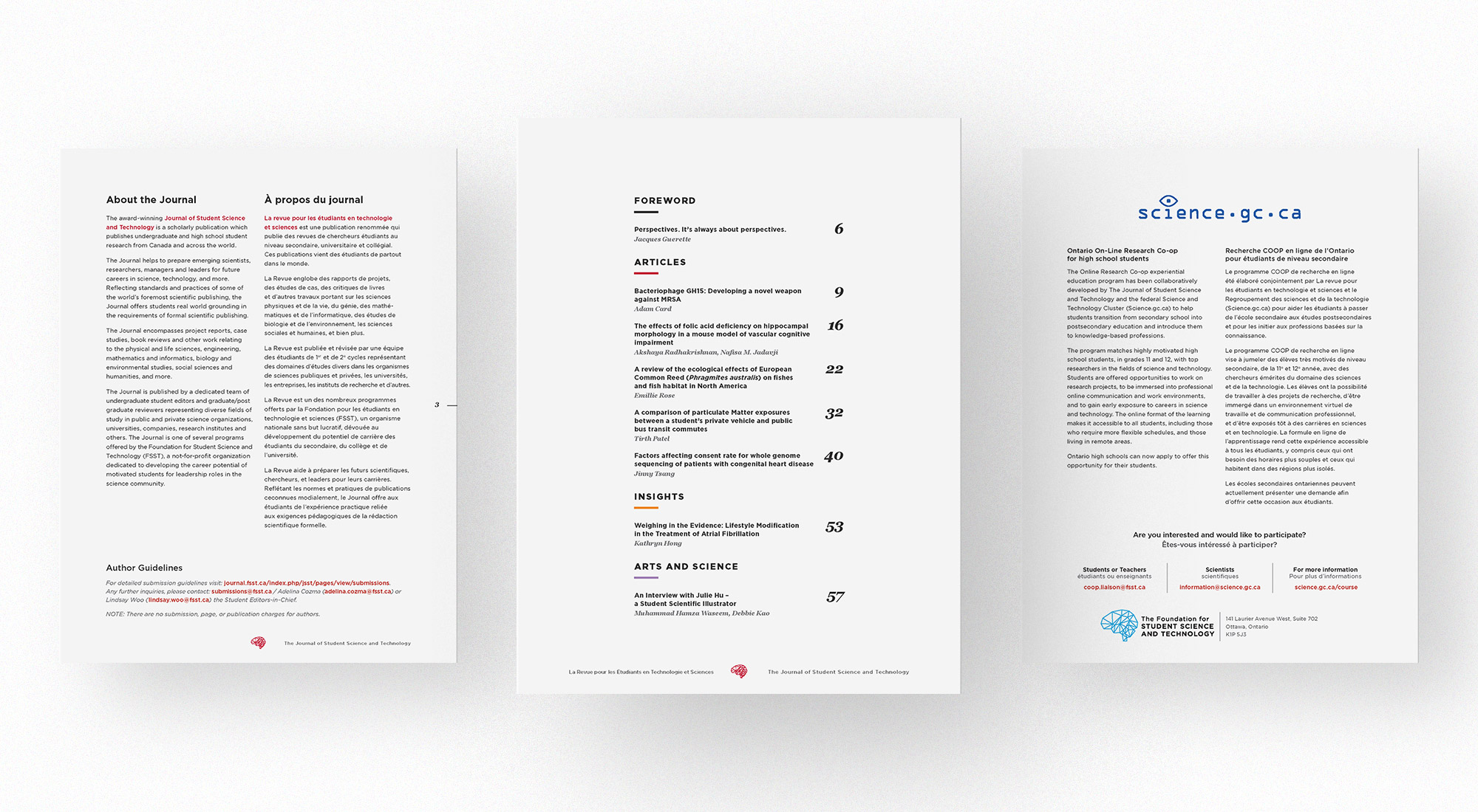
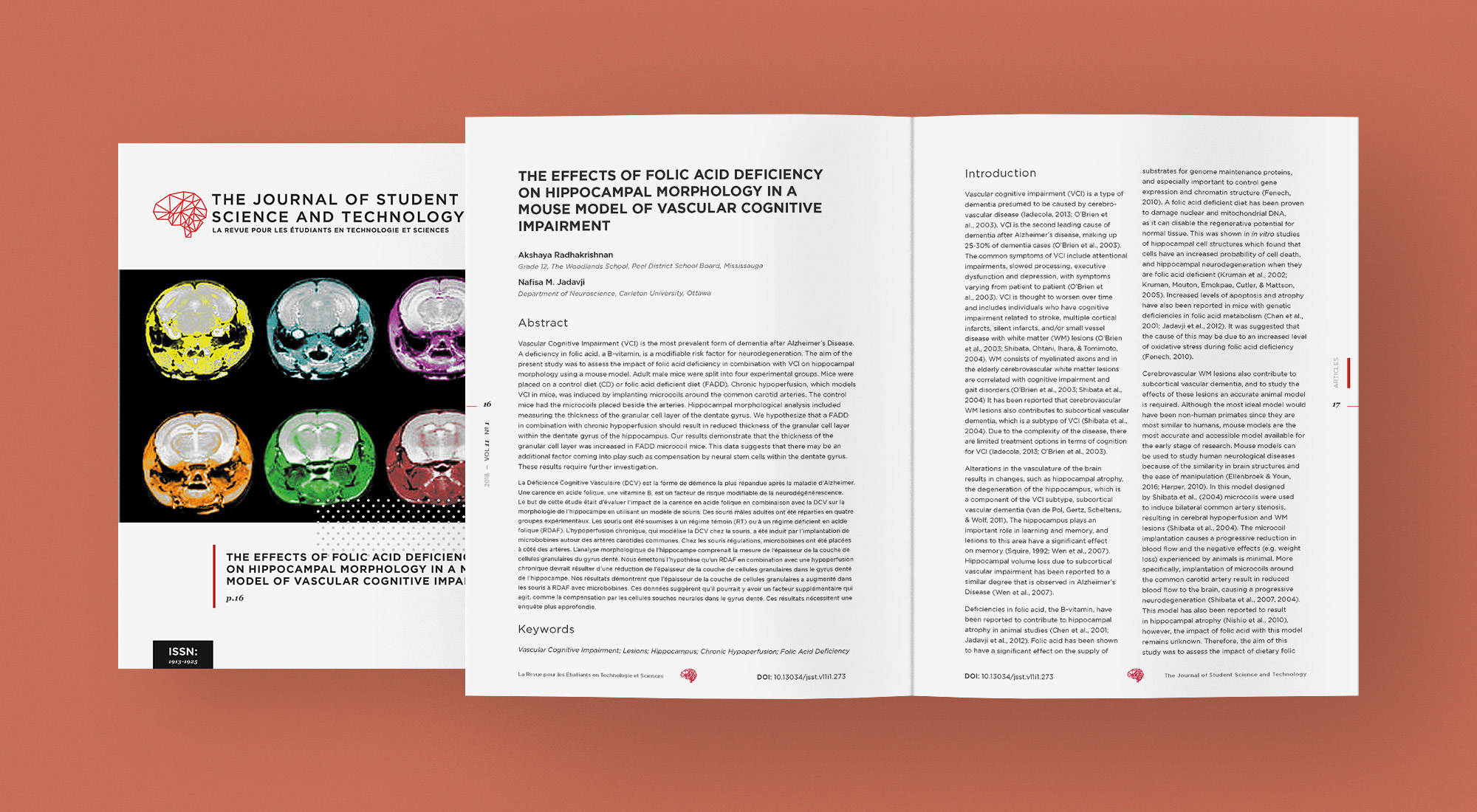
Our goal in the redesign was twofold: first, to better reflect the award-winning Journal’s identity as a respected, peer-reviewed scientific publication, similar to other academic journals like Nature or PLOS One. Second, to cater to a modern audience – particularly those in the scientific community. To that end, we kept the overall design conservative, allowing the content to take centre stage. Building off the bones of the Journal’s previous design, we used a distinct typographical hierarchy, complementary typeface pairs and careful control of colours, ensuring a look and feel that was current as well as sophisticated.
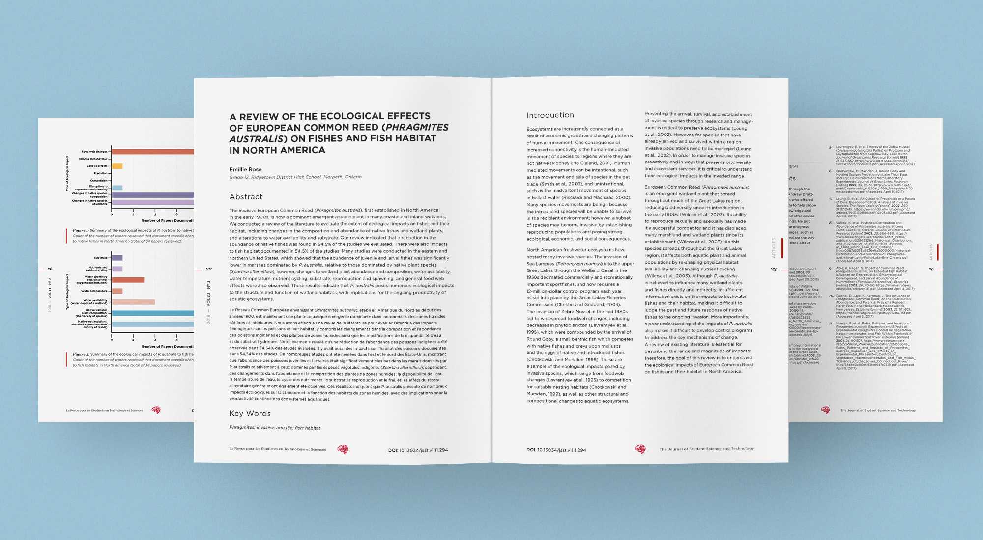
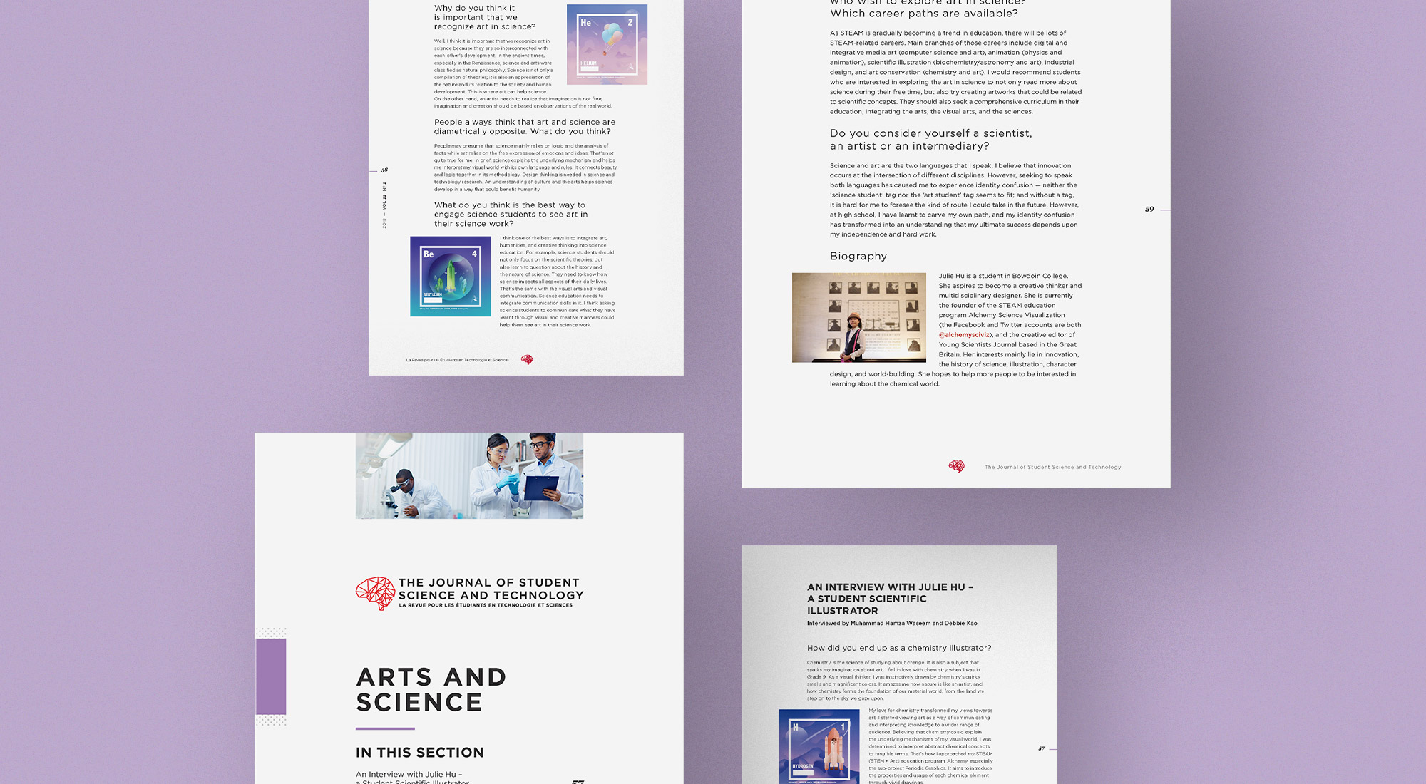
Written content formed the bulk of the publication, so it was essential to create a reader-friendly design. We used ample whitespace, adding an extra hint of modernity while helping prevent reader fatigue. Employing contrasting or embellished font weights and sizes, we added significant breaks between paragraphs, and section-specific colours in minor design elements (lines in tables, rules), all designed to create mental pauses for the reader.
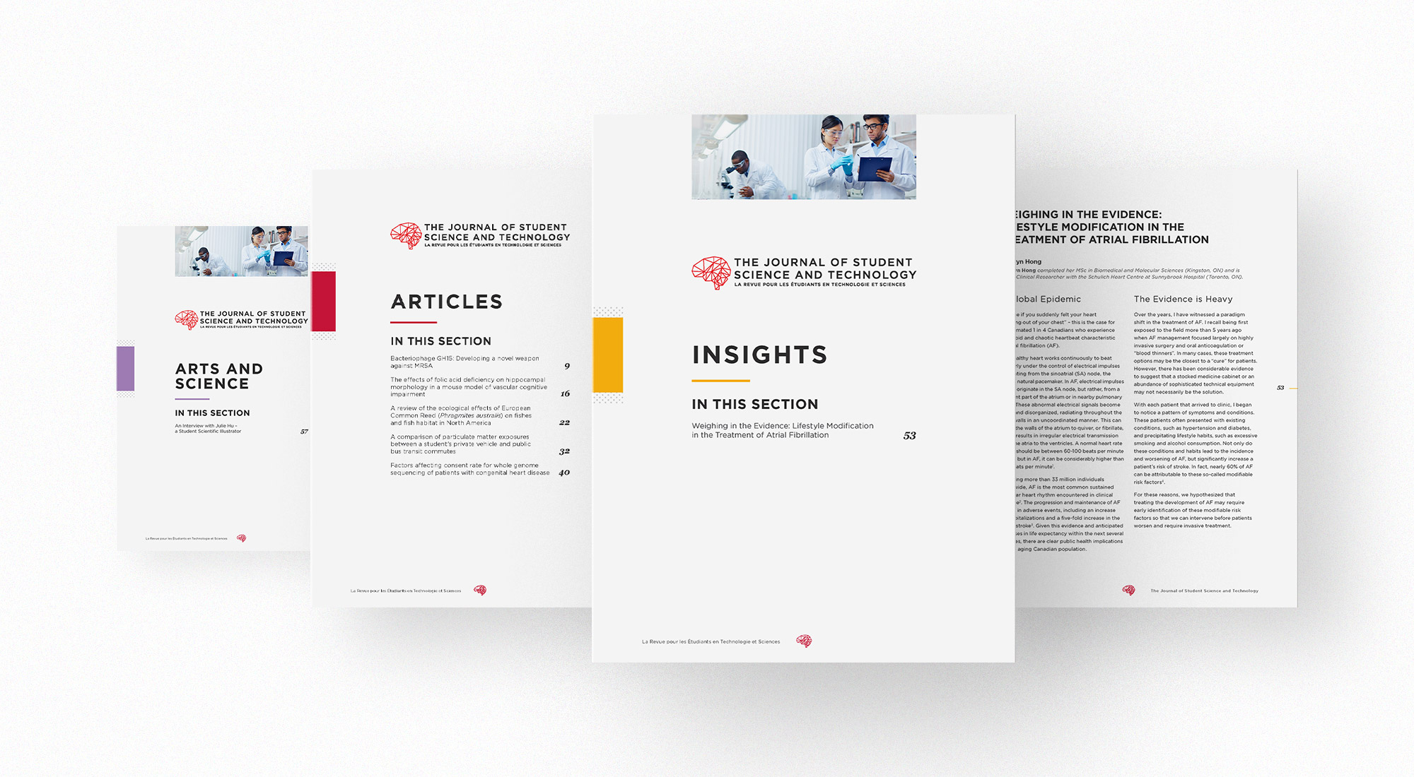
We added section dividers to organize the publication into appropriate categories. These pages act as small visual breaks from lengthy articles and offer the opportunity to insert snapshots of modular content within each section – preview imagery, a small table of contents, pull quotes, short excerpts. A side block of colour, inspired by the Journal’s original colour scheme, is included in each divider to help readers quickly identify which section they’re reading. Given the Journal’s vast array of topics, we knew that its design had to be adaptable and diverse. Our team developed modular layouts to accommodate various forms of content, such as mathematical equations, graphs, charts, tables, quotes/excerpts and imagery.

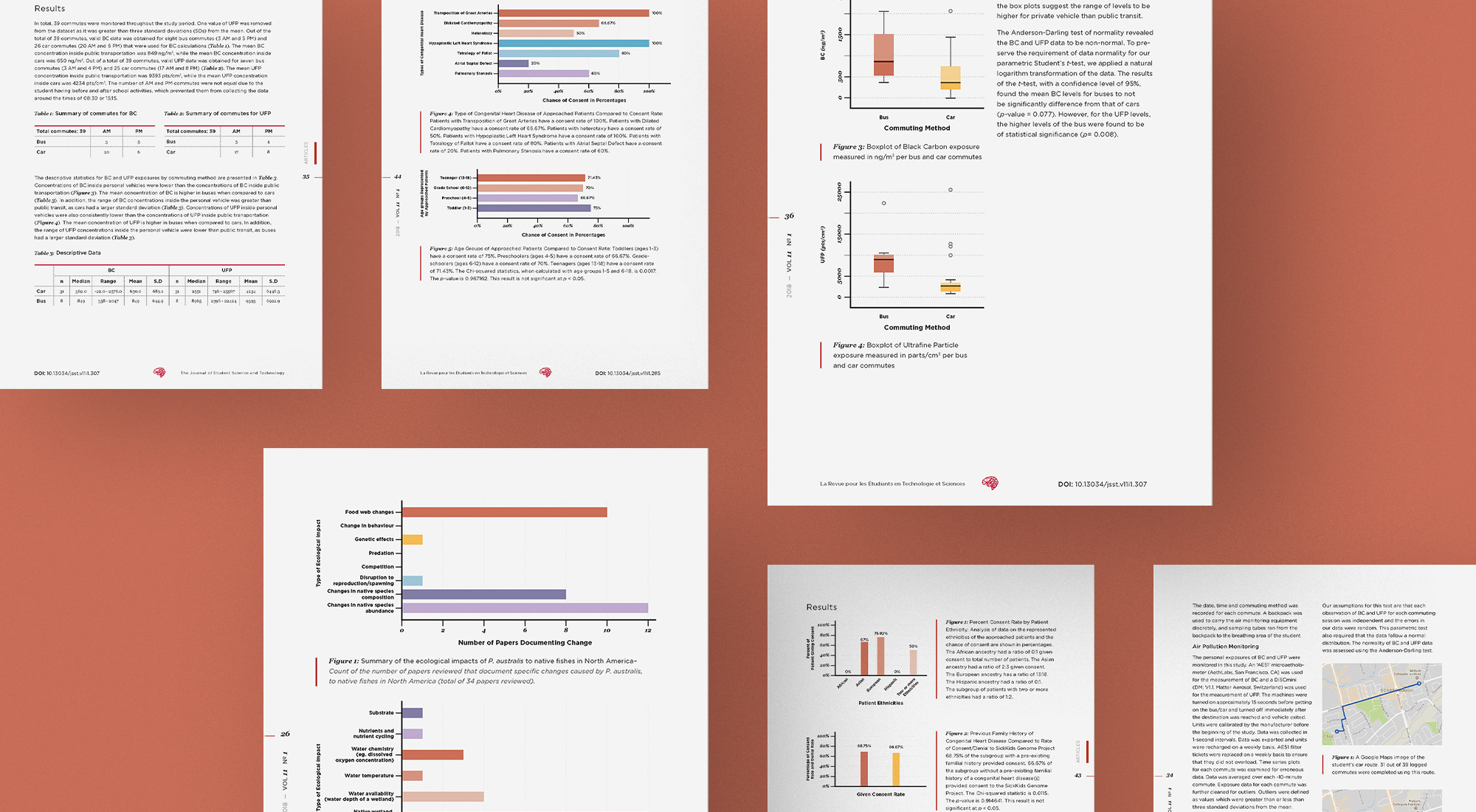
Our thoughtful, subdued design resulted in a polished and contemporary academic journal that will help build a solid foundation for future academics and expand the scientific community.