
// branding, identity
Swarbrick Law is a legal firm that has offered services in collaborative family law since 1997. They focus on guiding their clients through challenging moments in their lives: divorce, custody agreements, child and spousal support, property division and more. Through these tough times, Swarbrick Law provides a path forward employing effective, empathetic legal solutions.
After 20 years in business, Swarbrick Law was ready for a new corporate identity that would reflect their years of experience and professionalism.
Because Swarbrick Law is a collaborative law firm, their logo needed to represent cooperation and positivity while being appropriate for the sensitive nature of family law. We decided that the best way to proceed was to create an identity that didn’t draw on common legal motifs but instead employed simple, recognizable shapes to convey a deeper meaning.
Our solution was a pragmatic identity with a multifaceted rationale. We applied two “Ls” (the letter of the law) and arranged them to symbolize unity and used two outward-facing arrows to represent diverging parties protecting an inner core and keeping it intact. The shape also evokes the idea of light at the end of the tunnel.
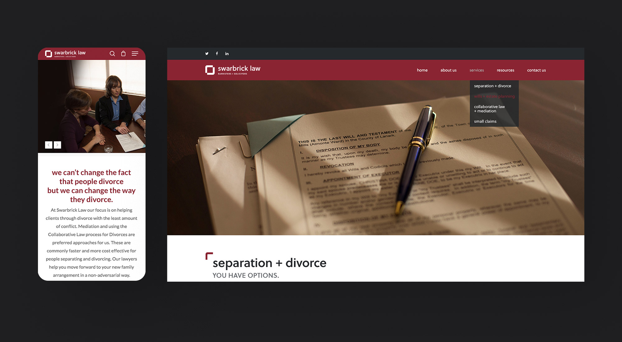
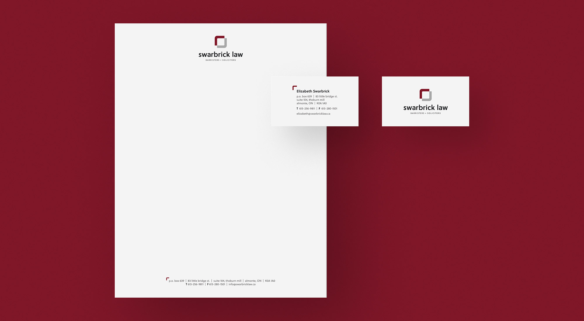
We designed corporate stationery, including business cards and letterhead, as well as outdoor signage and email signatures, all featuring the new identity. We also refreshed Swarbrick Law’s web presence by updating their site to reflect the new logo and corporate colours.
The brand and identity we designed for Swarbrick Law communicates a positive, cooperative message of mutual agreement and progress. It reflects the unbiased and collaborative approach that Swarbrick Law brings to each client.