
// corporate identity
Soundsations is an award-winning Ottawa Wedding DJ with over a decade of experience in the industry.
The DJ, Mark, places customer satisfaction above all else, customizing his service offerings for different needs, maintaining meticulous organization and making sure the couple is always the centre of attention. Because Soundsations specializes in the wedding industry, planning and preparation are paramount; everything must go smoothly.
After many years of successful weddings, Mark wanted to refresh his corporate identity to better represent his level of professionalism and style of operating. He wanted a logo that instilled confidence that Soundsations could capture a client's taste in music and make the right judgement calls to set the proper tone for different moments throughout the event.
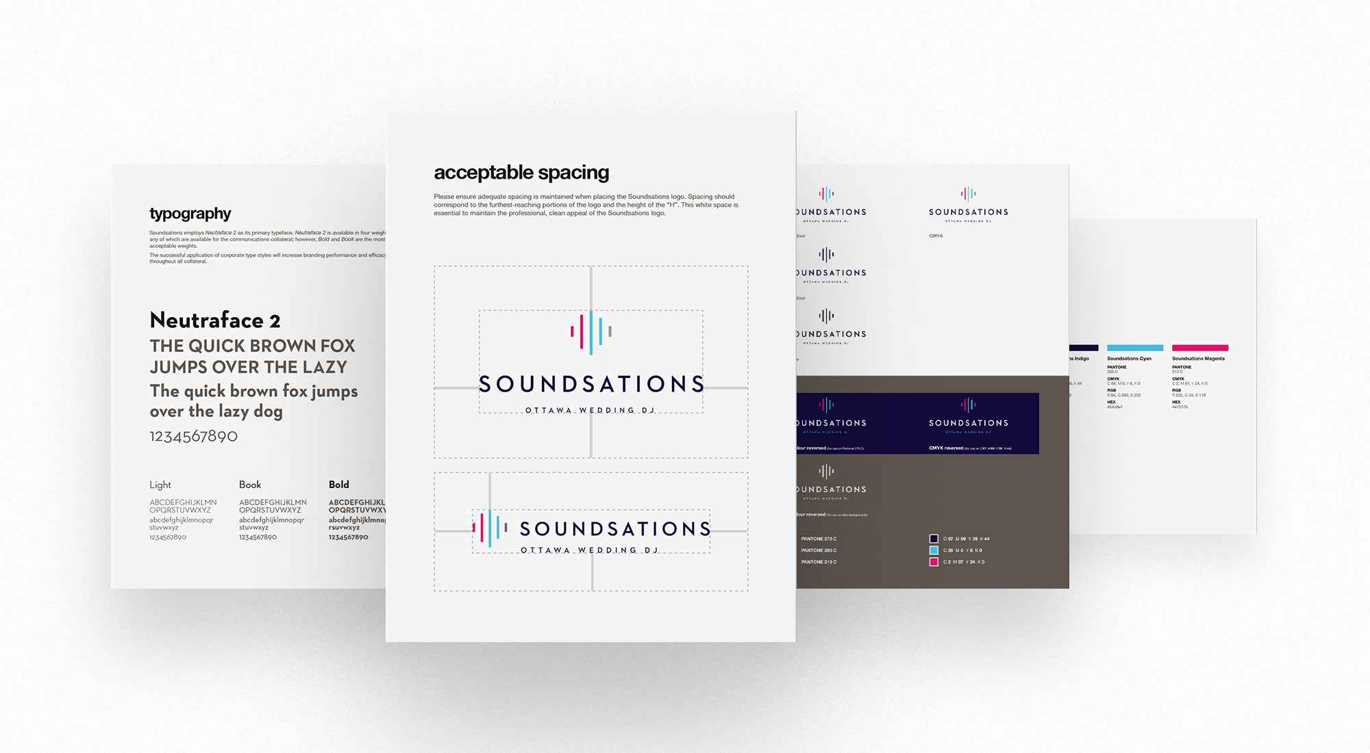
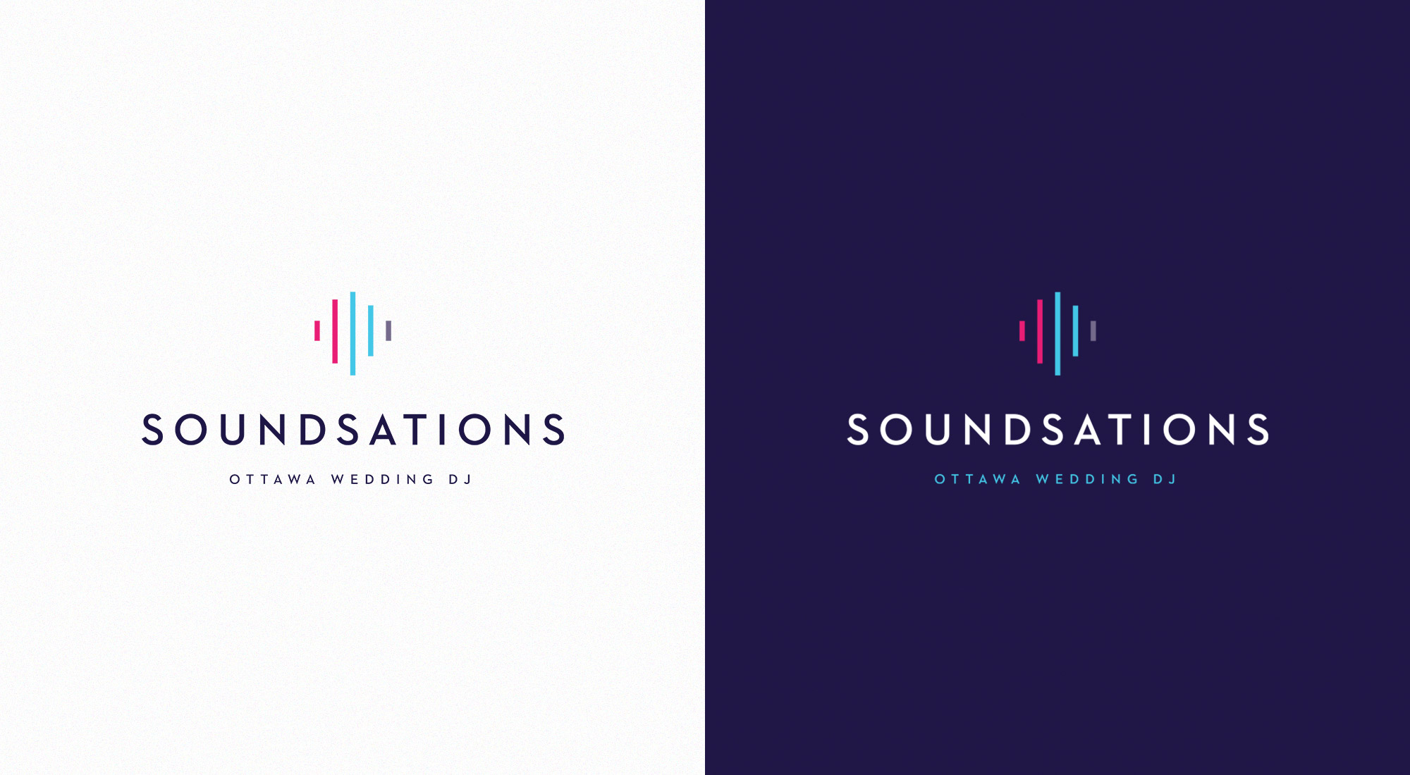
We decided to proceed with a brand refresh instead of a full rebrand, a decision that is appropriate for businesses with a high brand recognition among clients and the general public, and whose logo still represents the company values accurately. The original Soundsations logo consisted of an abstract representation of two LED soundbars, paired with an all-caps sans-serif wordmark. We explored several different designs within this concept, some closer to the original logo and some further away, and we proceeded with a version consisting of one LED light bar flipped sideways to create an abstract shape also reminiscent of a soundwave. We selected Neutraface 2 for the new logotype and set the text in all-caps to maintain consistency with the original identity. The result was a simplified and modernized version of the Soundsations logo that supported brand recognition but better suited the Soundsations brand personality and values.
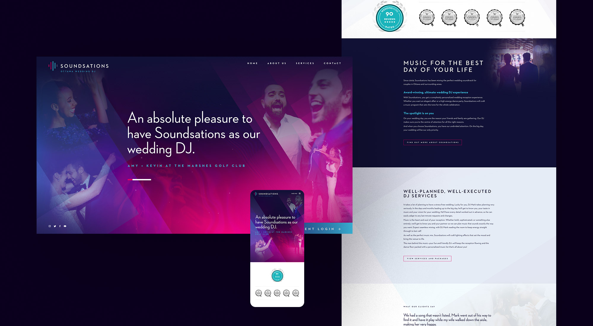
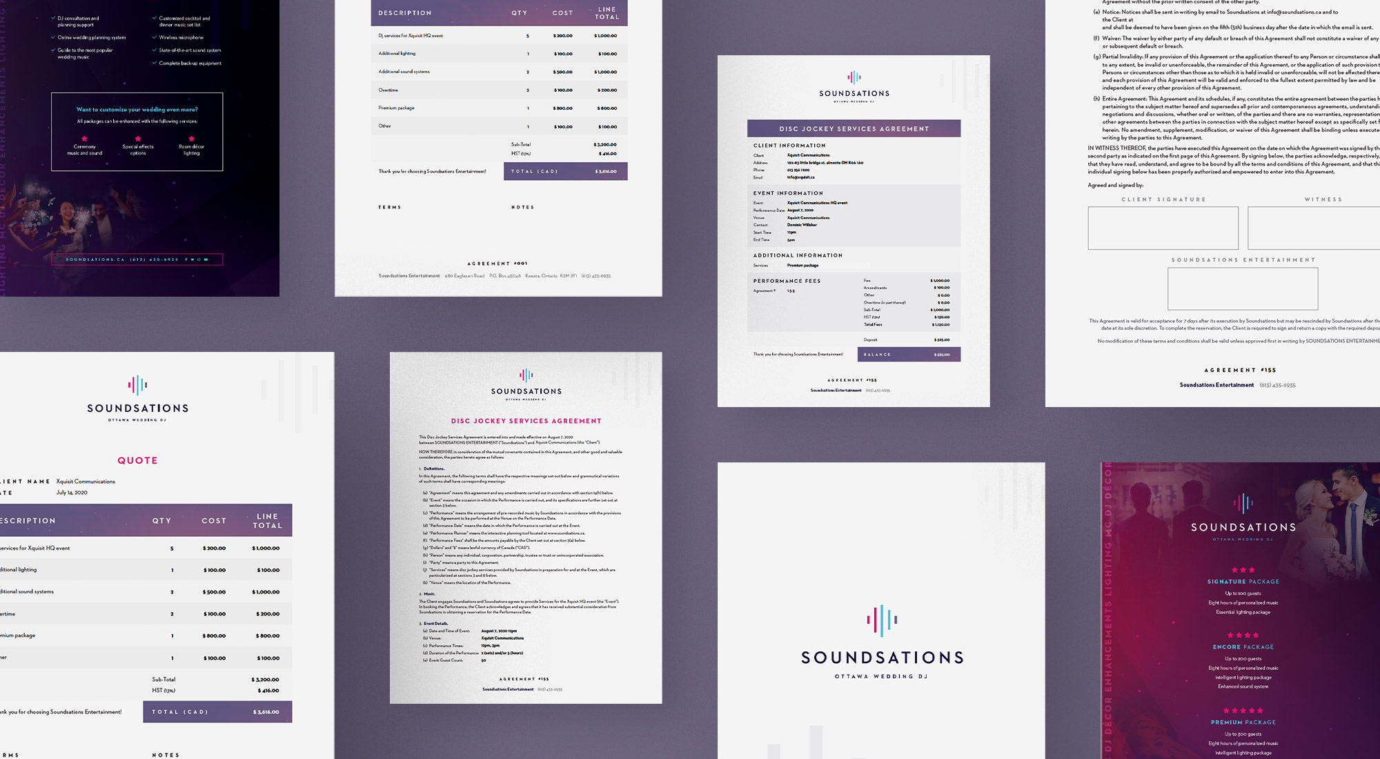
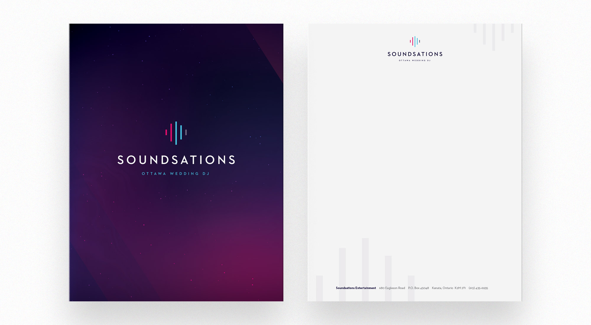
The next step in the branding process was creating collateral that would determine the look-and-feel of the Soundsations brand identity. We began with a re-design of the Soundsations website, which provided information about the company and allowed customers to book services. We re-imagined the written content from the previous site to explain Soundsations' mission in a consistent tone and persuasively present its services. We created a graphic for the homepage consisting of overlapping angles with Soundsations branded blue, indigo and magenta gradients and a speckled overlay. The final result was a dreamy background, subtly reminiscent of the night sky. We applied this graphic and the gradient angle treatment to other Soundsations print and digital collateral such as a kit folder with stationery, financial and legal documents, tradeshow banners, promotional cards and social media platform graphics.
The refreshed Soundsations brand is contemporary, professional and attention-grabbing, setting Soundsations apart as an industry leader and creating consistency and brand-recognition throughout all collateral.