
// branding, identity
Northwind is rural high speed internet service provider. The company was formed by a team of local entrepreneurs in 2004 in order to bring internet to their small community of Constance Bay. Since then, they have grown to service all of West Carleton, providing efficient, high performance internet through their personalized service – at rates comparable to many larger providers in the city.
Northwind needed a logo and branded promotional materials to communicate their local presence and comprehensive service offering. They wanted to convey their dedication to being a superior internet service provider devoted to personalized service and competitive pricing, and to demonstrate their commitment to the local community.
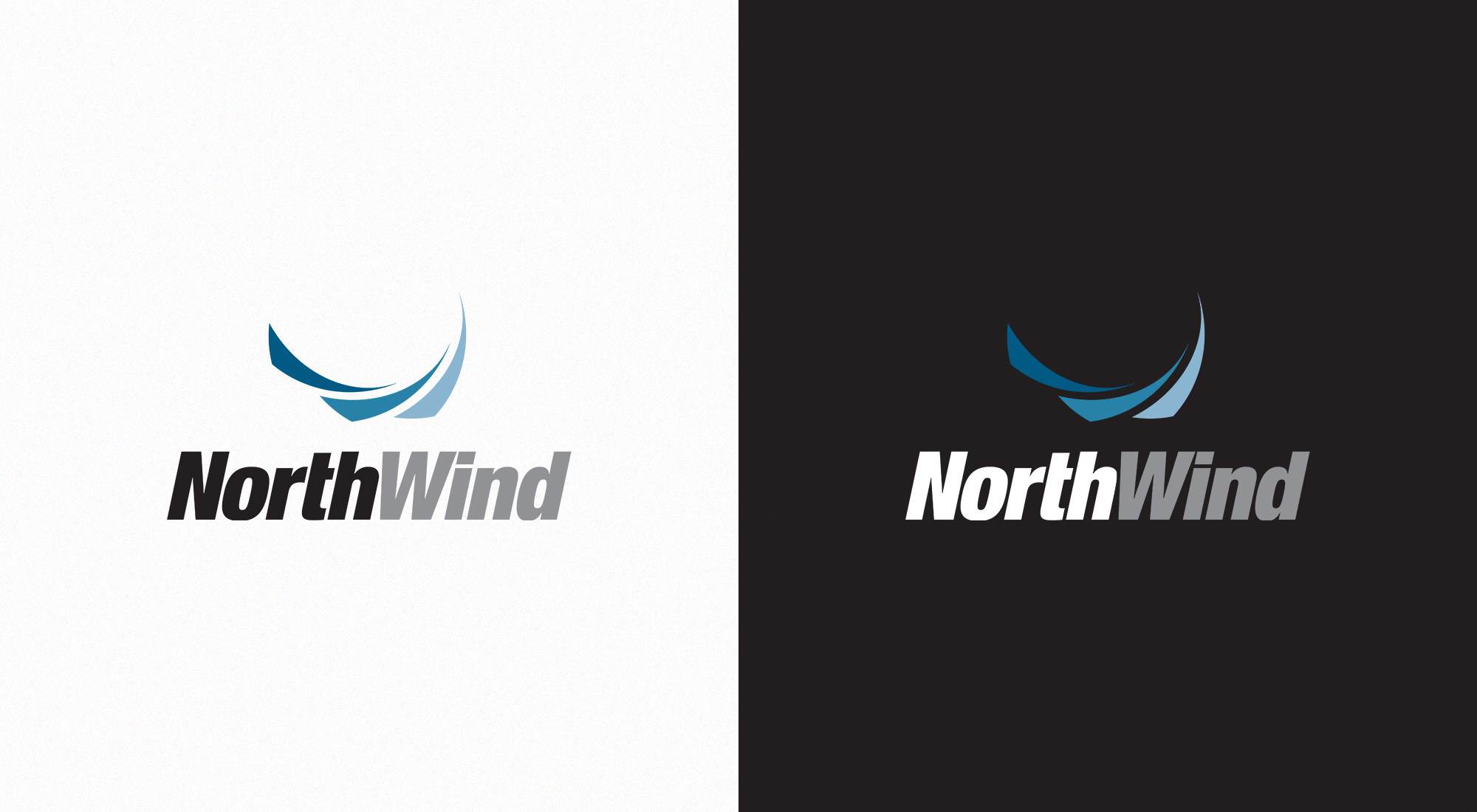
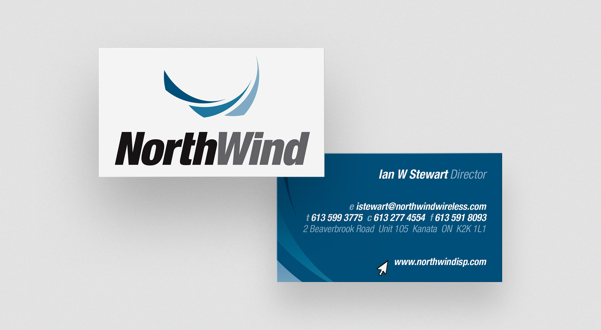
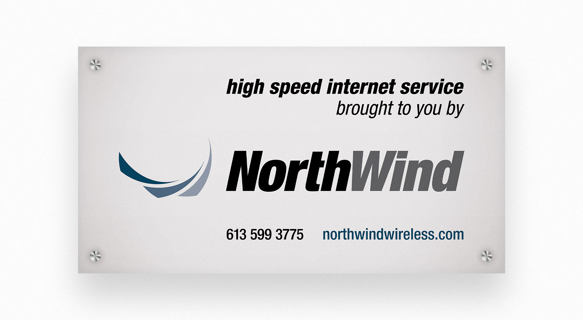
We developed a symbol reminiscent of wind through stylized swooshes, and paired it with a bold, highly legible typeface. We chose a blue and black colour theme for a strong, complementary palette. We used the swooshes throughout their collateral to add layers and dimension to their imagery, and build a memorable, distinctive theme.
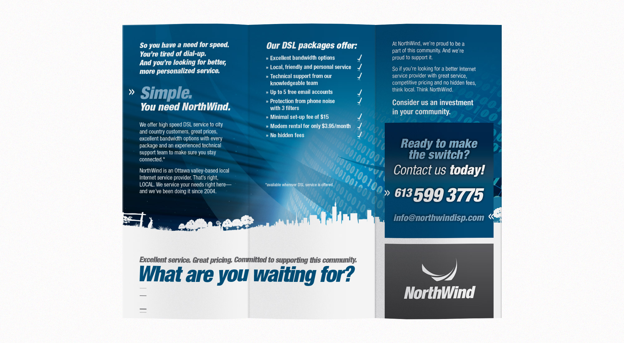
We collaborated with their team to write and develop a promotional brochure. We assisted them in narrowing down their goals as a company, in order to most effectively and concisely communicate their service offering through targeted messaging.
We developed graphics for their vehicles and signs and advised them on how to continue to uphold their brand and demonstrate their relevance in a competitive marketplace. The materials developed for Northwind convey their dedication to their neighbours and community and establish them as a reliable provider of high speed internet to rural communities.