
// branding
After working many years in the construction industry, Jamie Winters founded his namesake company – Jamie Winters Construction – in 2020. He acts as the project manager for high-end construction contracts in the Mississippi Mills region.
A local Almontian, Jamie came to us to help him create an identity and develop a brand for his new company.


Jamie wanted an identity that looked elegant and sophisticated – the idea of the chickadee was born out of a conceptual play on the Winters portion of the name. The Black-Capped Chickadee is a species of North American wintering song-bird that build their nests out of moss, feathers, fur and other coarse fibrous materials. The chickadee was a fitting and unique symbol for a construction company because they are a native species to Canada, Canadian-winter-hardy, resourceful nest-builders and an identifiable bird in both look and sound.
We used the chickadee to communicate the dual faceted nature of Jamie Winters Construction. We positioned the chickadee to sit on a spacious nest, the extra white space around it reinforcing the theme of an elegant, high-end home and expressing the construction half of the business. The chickadee's watchful eye represented the managerial aspect of Jamie Winters Construction, signifying his comprehensive and quality service.
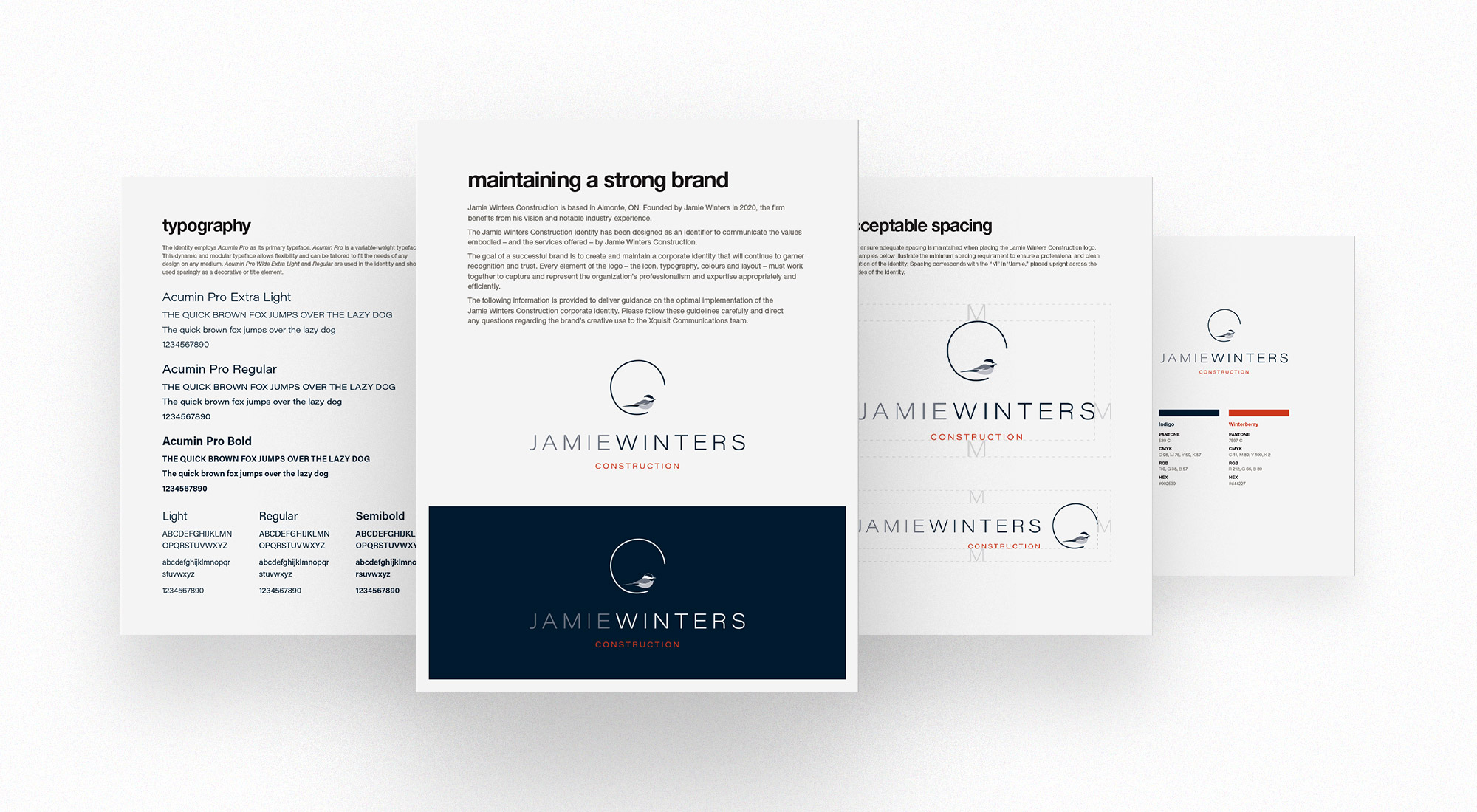
We continued the winter theme in selecting the brand colours. The early twilight of winter is embodied in the primary brand colour: indigo. The foil to indigo is winterberry, a bright red berry commonly found hanging from frozen bushes dotted across snowy fields, making the perfect companion colour to highlight elements. And of course – chickadees eat winterberries.
Acumin Pro is the corporate typeface for Jamie Winters, selected to convey elegance and luxury. Spacious and slender letterforms with a pleasing width-to-height ratio evoke an architectural feeling and continue to reinforce the idea of sophistication. As one of the most robust variable fonts available, it allows for ultimate modularity and customization, thematically appropriate for Jamie Winters Construction's mandate.

We created an essentials brand guideline document to ensure careful stewardship of the newly created identity. The material outlined the employment of different logo variants, the appropriate usage of the corporate typeface, the correct applications for each identity file type, and the implementation of logo spacing and brand colours.
Following the brand guideline, we developed a stationery suite comprised of letterhead, envelope and business card designs.
With their new brand at the helm, Jamie Winters Construction is prepared to distinguish themselves in the competitive market of custom home designing and building.