
// branding, identity
Jask is a day spa in Ottawa’s Stittsville neighbourhood offering luxurious spa treatments, registered massage therapy, salon services and skincare. Their goal is to uphold the highest standards in the wellness industry and help their customers feel confident and relaxed.
Jask needed an updated design philosophy to embody their mission and team’s talent and to create an excellent first impression on potential clients. This included a new logo, a website redesign, outdoor signage, and a stationery package including business cards, gift certificates and indexed cards with a list of services and treatments.
The new Jask identity needed to convey style, professionalism, expertise and luxury. Their goal was to increase their visibility to clients in their surrounding area, from Arnprior to Ottawa. Like their current customer-base, their target audience was predominantly female and ages 20–60. Jask operates in a beautiful stone building with bright circular lights and soft interior details. Therefore, its new brand needed to contrast the old-fashioned location with an elegant minimalist design to create a complementary and appropriate mix of authenticity and simplicity.
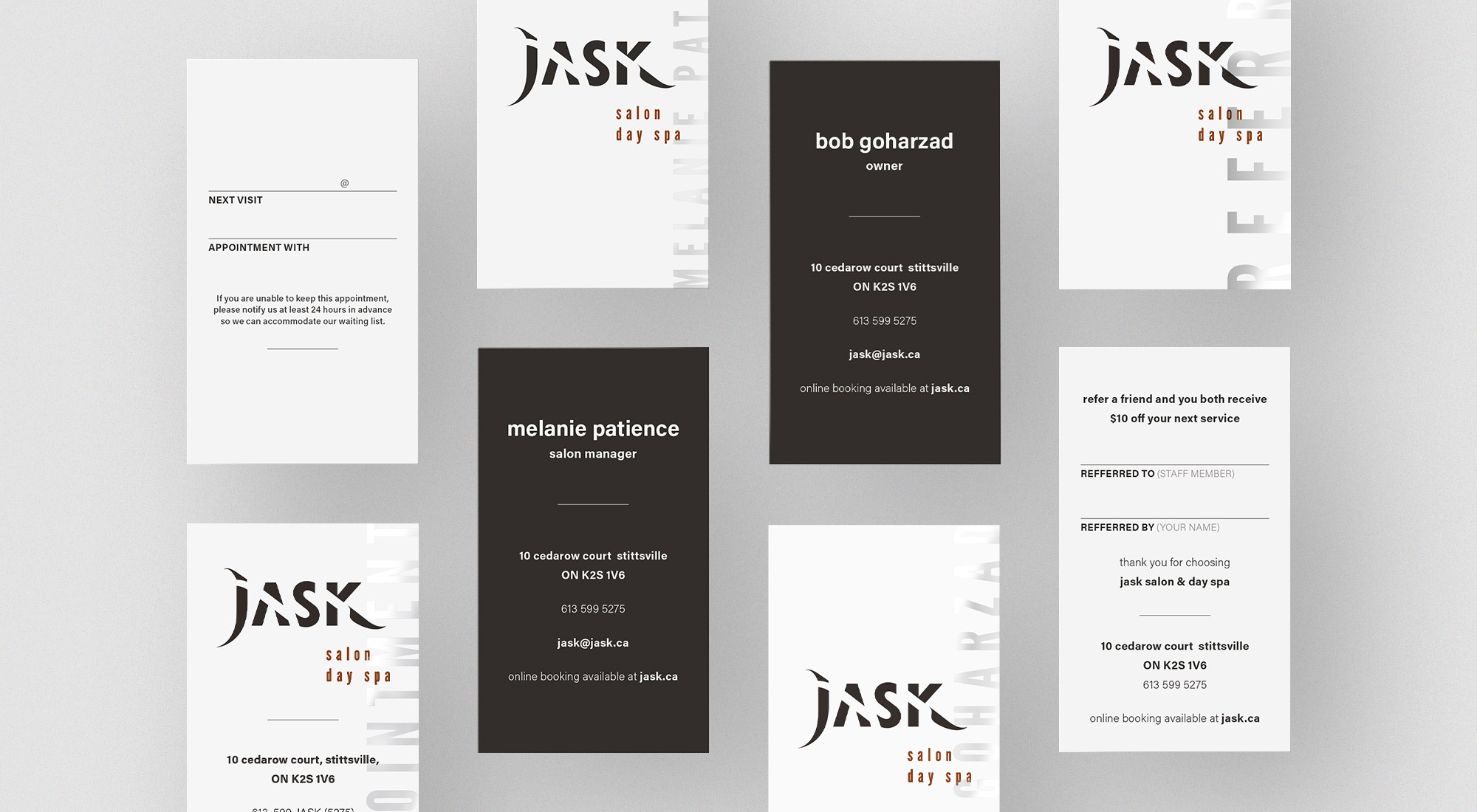
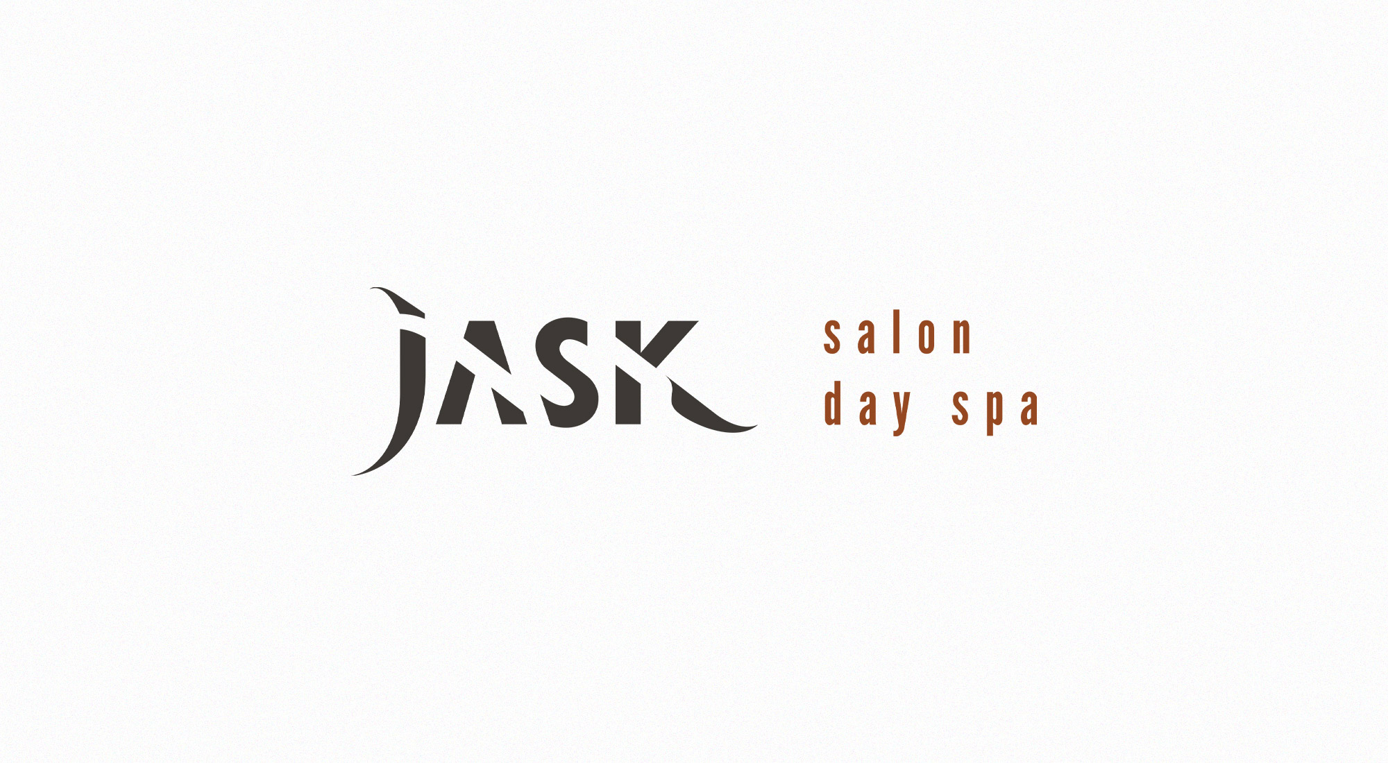
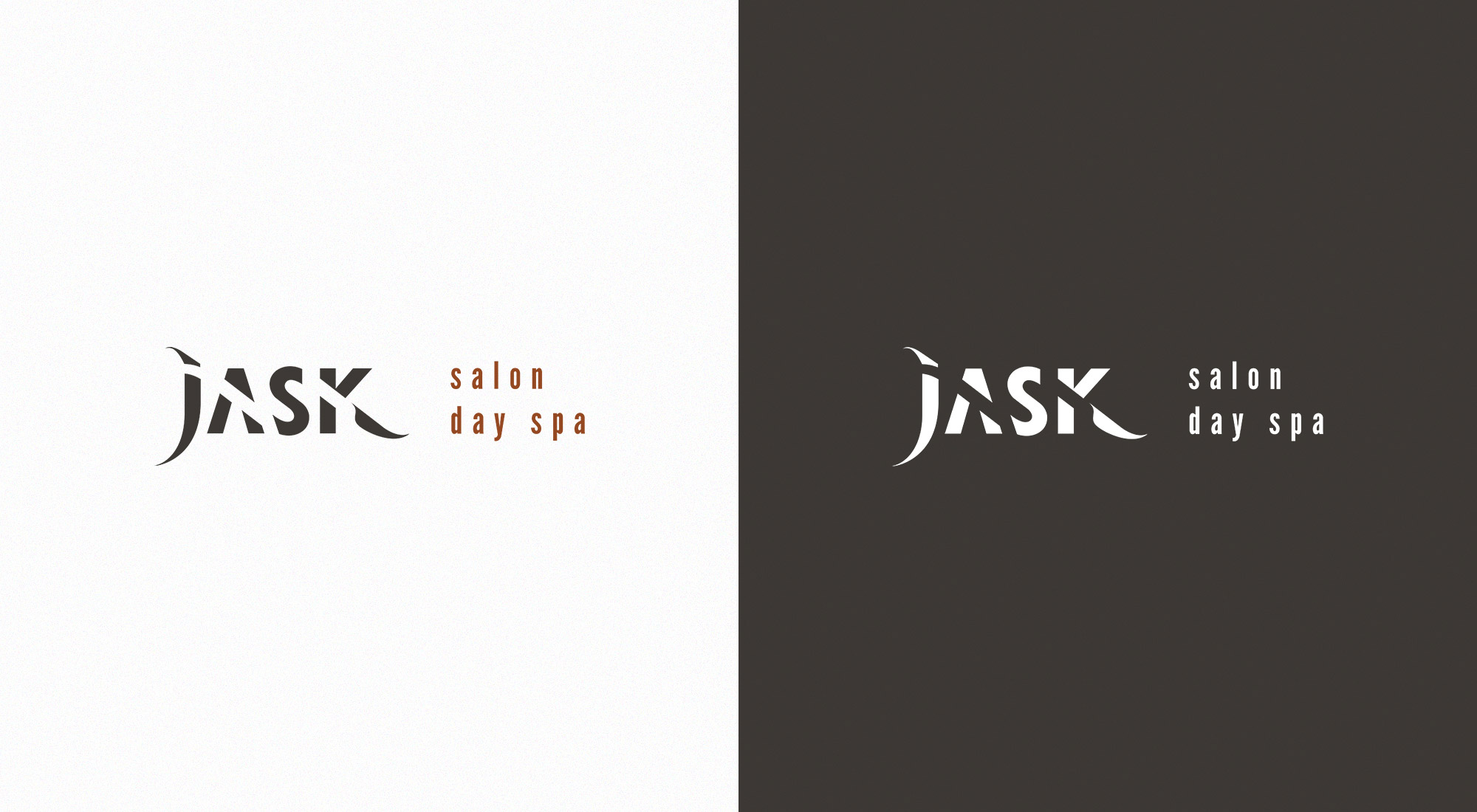
To elevate the identity from an everyday regular-looking salon to a fashionable and sleek oasis, we created a custom logotype with smooth curves and sharp angles. We exaggerated the tails on the J and K to create a modular interpretation of hair, eyelashes and brows, water, air and waves of relaxation. The whitespace inside the A and K supports the logo’s flair and contributes to an airiness fitting for a day spa.
We paired the customized lettering with a tagline set in a condensed lowercase typeface, League Gothic. We selected this contrasting typeface for its juxtaposition – a similar but not identical type treatment would have created a visual imbalance. The geometric elements of the tagline combined with the glossy curvature of Jask elevates the design and supplies it a high-end, modern appearance. The logo’s greatest strength is its recognizability, uniqueness and subtle nods to the original Jask identity.
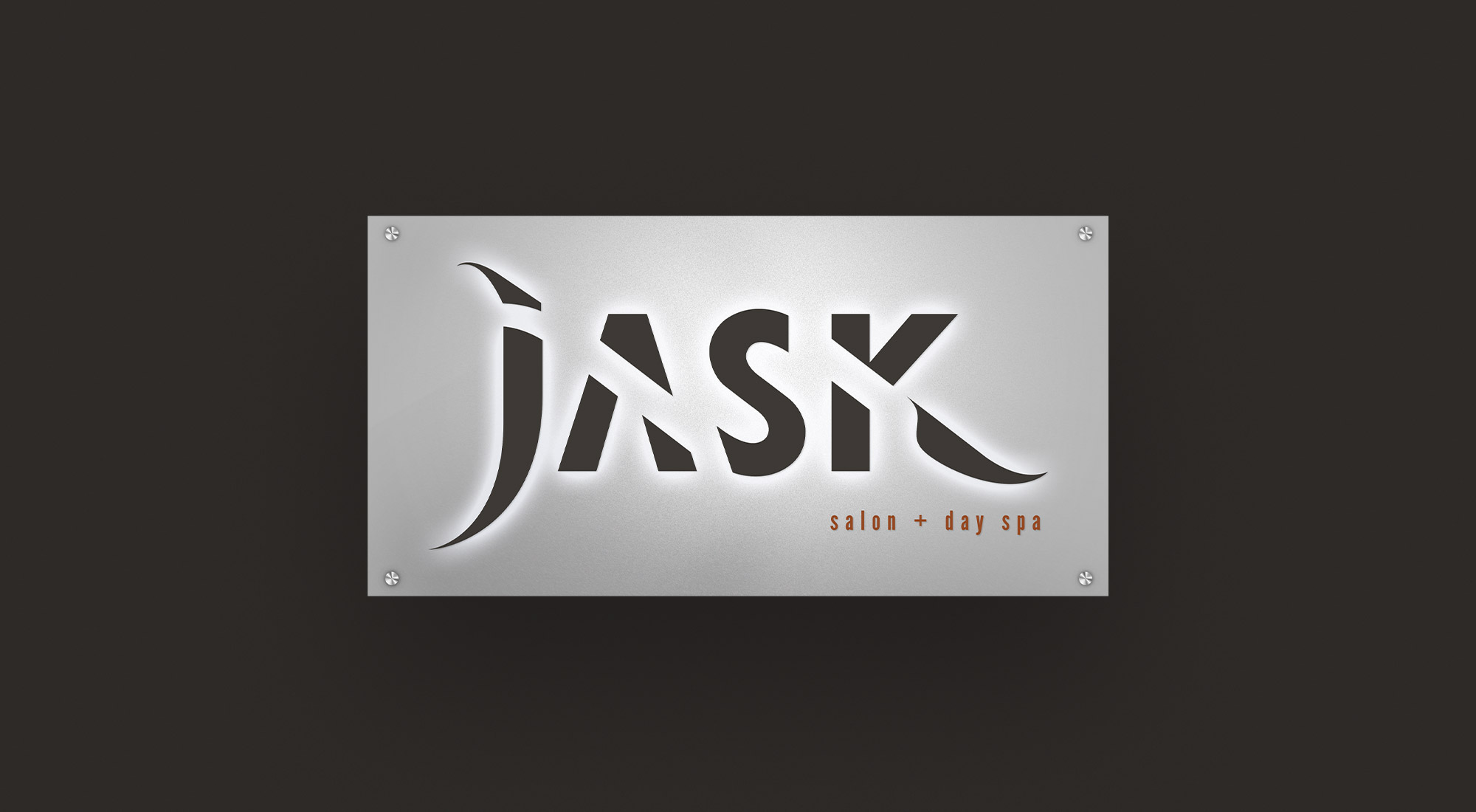
Building on the new Jask brand, we extrapolated the identity into a full suite of collateral, including a website, a service brochure and business cards with spot UV treatment and signage for the exterior of the spa.
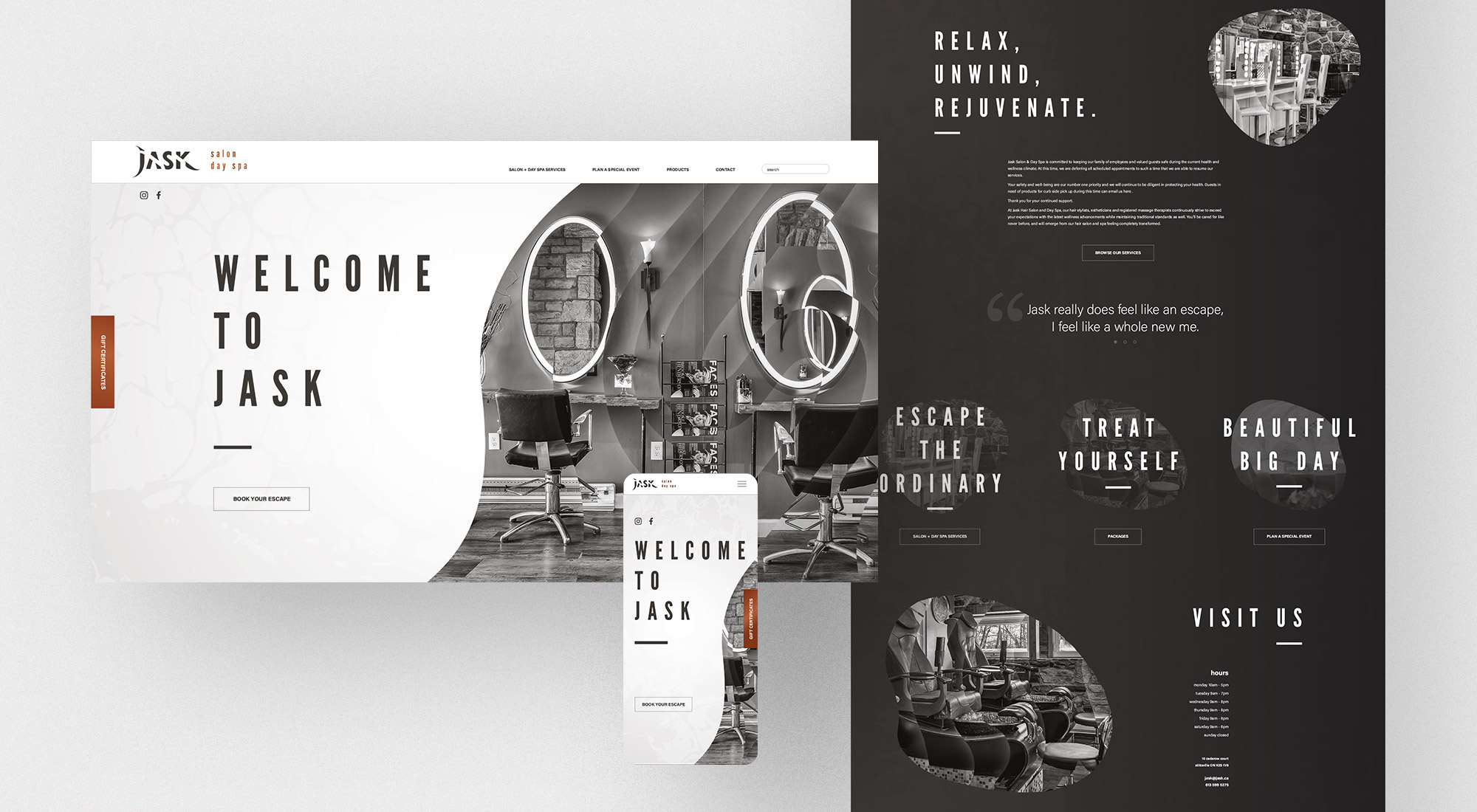
As Jask’s primary online platform and main customer conversion point, their website needed to instill the highest level of elegance and modernity. To create this elevated appearance, we utilized generous whitespace, contrasting type sizes and delicate key lines separating content blocks.
The imagery on the site was treated with an abstract overlay, reminiscent of marble or swirling water and present in other Jask collateral; the primary focus of photographic subject matter being their beautiful location.
Large titles and interactive clickable areas were chosen for the user interface design to improve the visual hierarchy of the page and improve the website’s user experience.
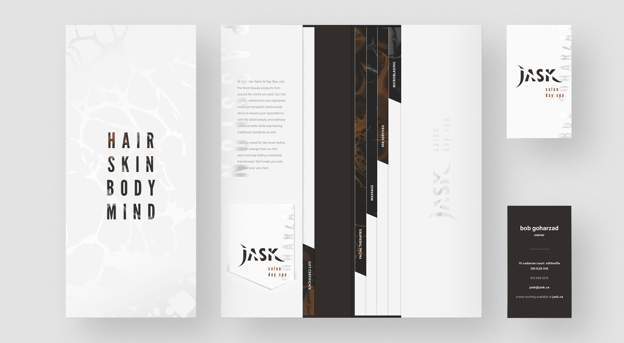
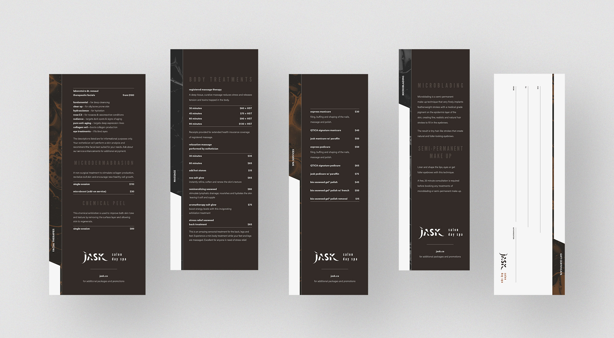 These inserts taper in width to showcase all of Jask's offerings
We designed a stationery package to present Jask’s service offerings and introduce potential clients to the new Jask brand identity. This consisted of a multi-page, tabbed brochure with a spot-uv gloss treatment with a gift certificate and business card, explaining the different salon and spa treatments available at Jask.
Capitalizing on the clean, minimalist glamour of the new Jask brand identity, we kept the outside of the brochure white with a marbling spot-uv treatment and fresh, bold typography. As our eyes are naturally drawn to contrasting elements, we used a dark taupe for the tabs, creating a hierarchical reading order. These tabs were created to be removed from the enclosing folder and become individual brochures – divided based on the type of service.
The new brand mirrors the luxury, professionalism and relaxation found at Jask. It is unique and memorable, as well as modern – traits that promote an increase in visibility.