

// branding, identity
The Canadian Foundation for Legal Research is an institute that enables lawyers and other legal professionals to produce quality legal writing in a rapidly changing, increasingly complex field. The Foundation provides grants to leading professionals to support research that explores or enhances the practice of law regarding emerging or trending issues.
Since 1959, the Foundation has acted as a resource on legal writing, helping legal professionals navigate and familiarize themselves with Canadian law. In 2018, they turned to us to be their resource to develop their new logo and brand identity.


The Foundation is proud of their work supporting legal professionals and wanted the new logo to highlight their organization as a resource, first and foremost. We introduced the idea of a cube as a base to convey the notion of storage. Next, we integrated books into the design, representing knowledge and law (we had the phrase “by the book” in mind). We constructed all of this in an isometric space, which resulted in a hexagonal shape. The hexagon is the most robust shape in nature and a fitting metaphor to communicate the virtues of a reliable, well-defined legal system.

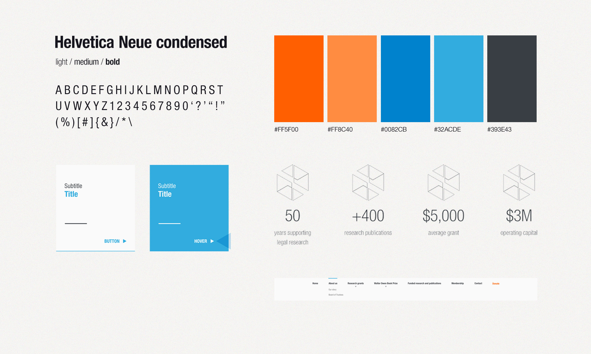
Following their rebrand, the Foundation engaged us to streamline their website and update other collateral to match the new look and feel. We developed colourful geometric bars and line shapes that complement the logo we designed, creating a visual motif that resembles puzzle pieces and speaks to the shifting field of Canadian law. Our team employed the theme across the Foundation’s entire brand, from their website to their stationery. The design can also easily be applied to future communications materials, further strengthening the brand.
With a strong and thematic identity firmly in place, the Foundation is ready to take on the challenges of an ever-changing field.