
// branding, identity
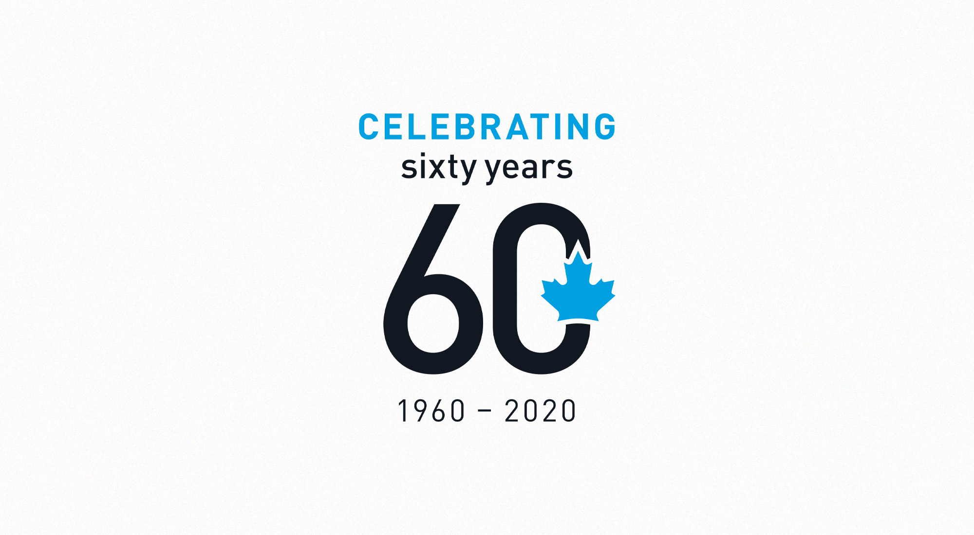
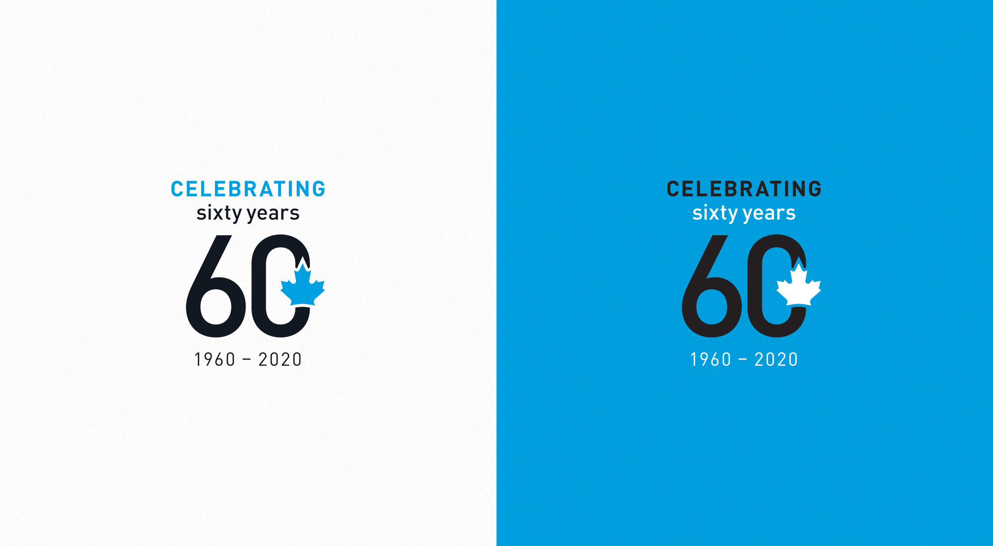
2020 marks the 60th year that the Canadian Nuclear Association (CNA) has sought to better the world by promoting the development, growth and advocacy of Canadian nuclear technologies for peaceful purposes. We were tasked to create an identity that celebrated and commemorated the non-profit’s milestone with a familial tie to the CNA brand identity and an elevated appearance.
 Social media posts
To ensure a complementary appearance to the CNA logo, we used colours from CNA’s branded suite and matched the typographical formatting in their brand guide. With the CNA being an inherently Canadian endeavour, we opted to integrate the maple leaf into the design as a symbol of national pride.
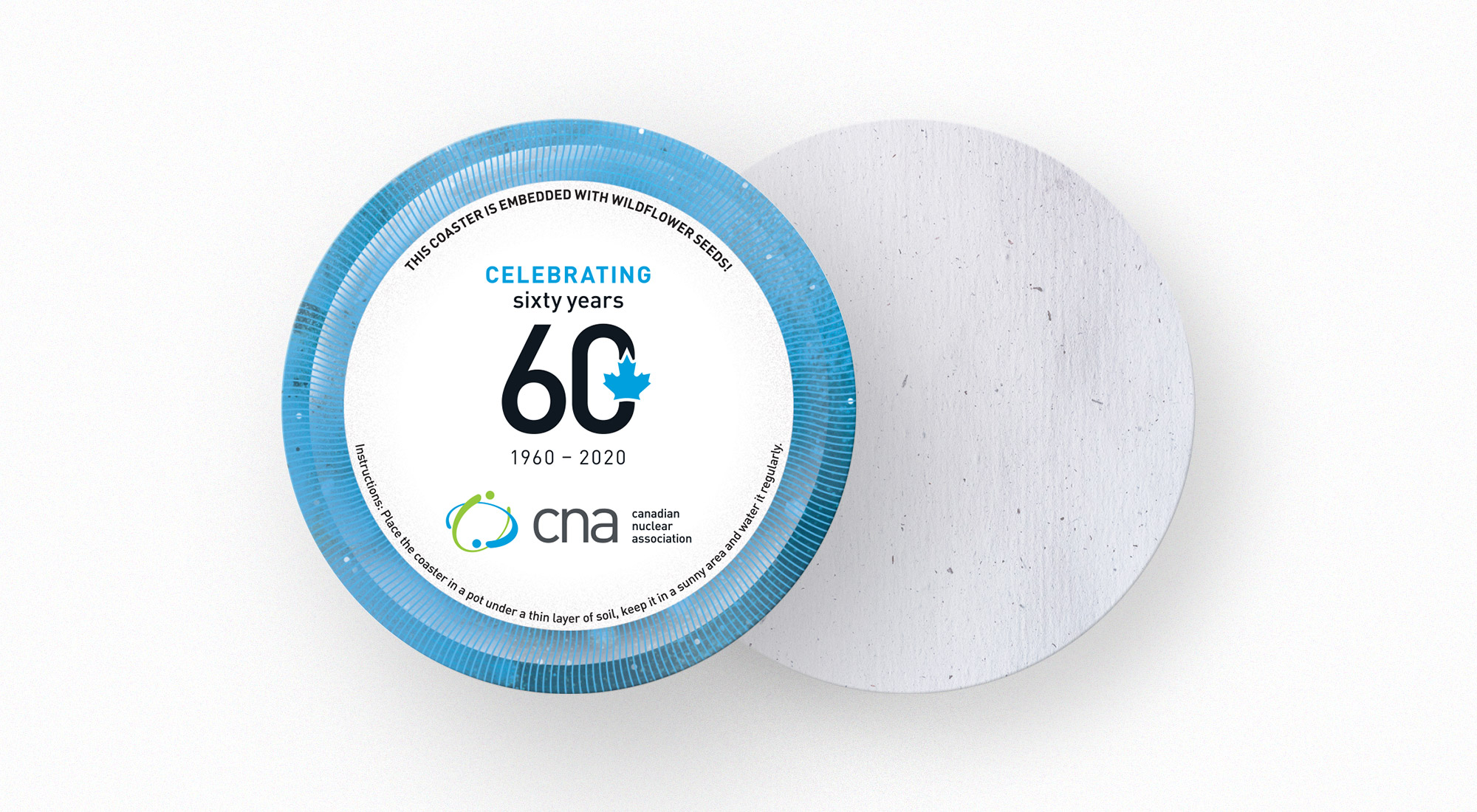 3.5" coasters printed on paper with wildflower seeds
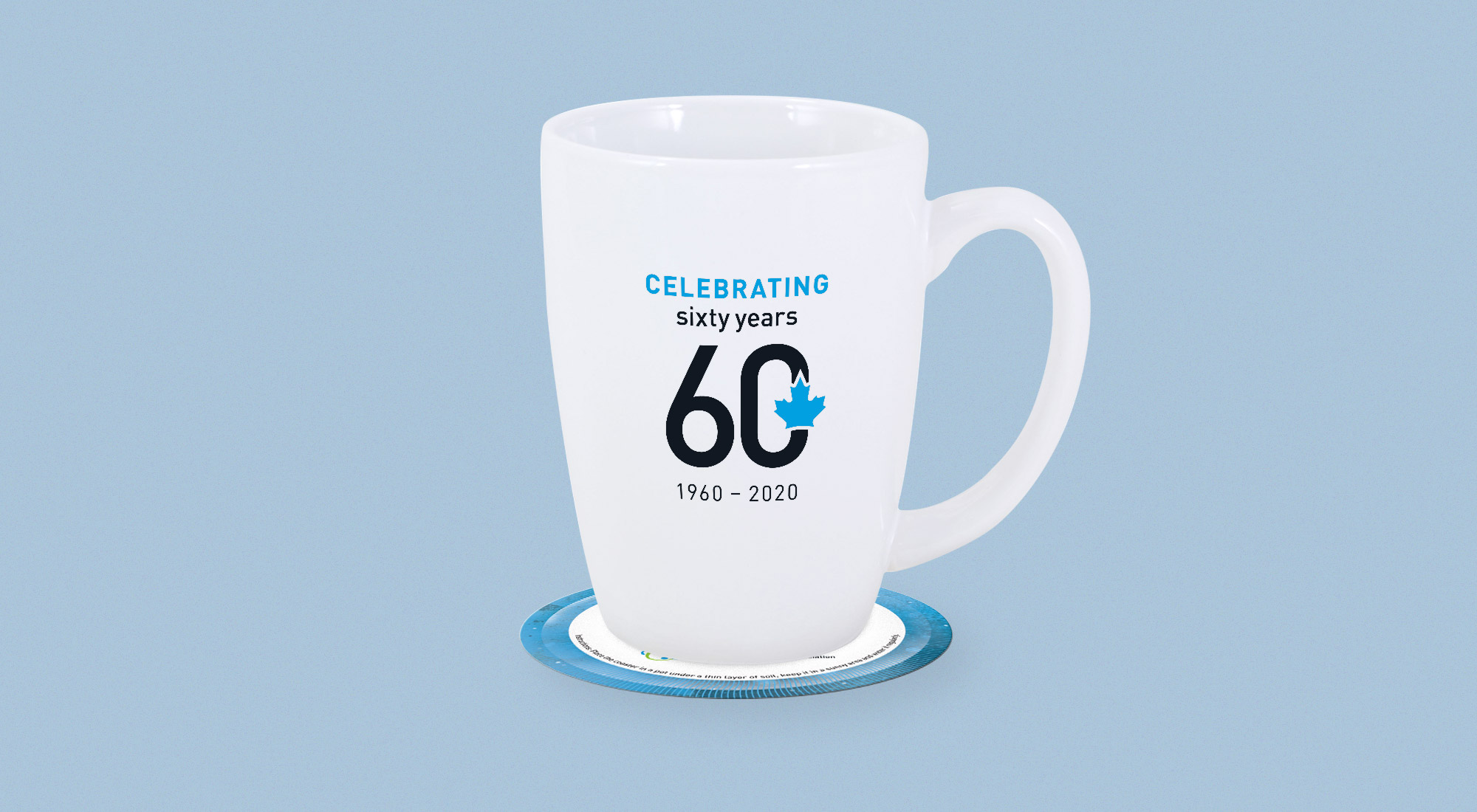
The identity was formatted for collateral and social media to be displayed and distributed throughout 2020. It was screen printed on mugs, coaster and balloons, which were distributed at the CNA 2020 conference.
The CNA’s milestone identity celebrates six decades of progress and their continued efforts to advocate for a better future.