

// branding, identity
The Canadian Nuclear Association (CNA) is a non-profit organization representing the nuclear industry in Canada. They promote the development and growth of nuclear technologies for peaceful purposes.
We’ve been collaborating with CNA for many years, building a wide range of bilingual communications and promotional material to convey their corporate objectives. As a long-time partner, we were entrusted to refresh the CNA brand in order to cater to a more corporate audience.
CNA works to advance the nuclear industry in Canada. They do this by fostering relationships and encouraging cooperation amongst various industries and associations that share a common interest in the development of economic uses for nuclear power. CNA works with educational institutions, government departments and agencies, and other authoritative bodies. They provide a forum for discussion to members, industry, and the Canadian public.
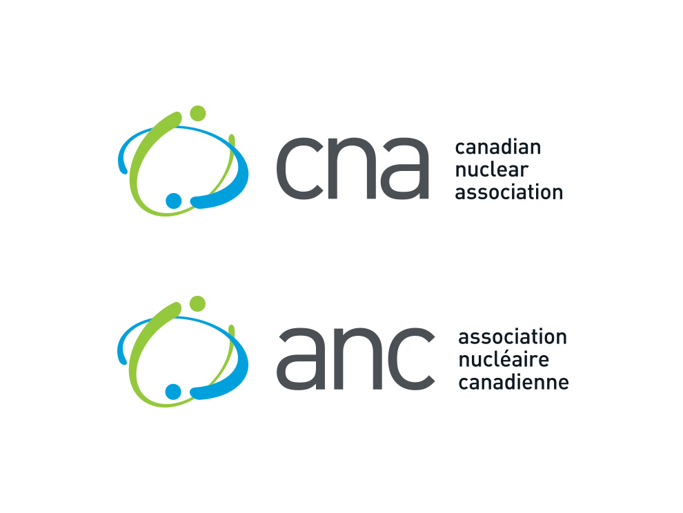
We wanted their new logo to depict the nuclear industry while communicating the idea of collaboration. We developed a concept for their new logo based on stylized orbital paths, using colours from the previous brand for visual continuity. The composition creates optical dimension, and evokes the idea of nuclear and atomic energy. We paired the symbol with clean, contemporary letterforms to convey CNA’s progressiveness, and built it into English, French, and bilingual versions.
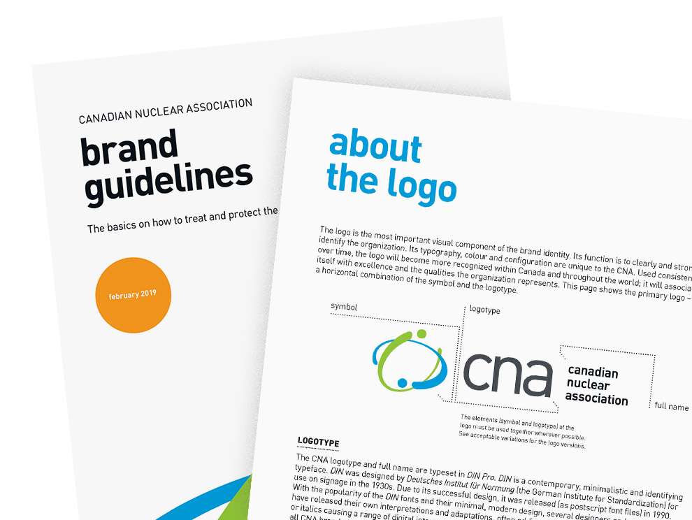
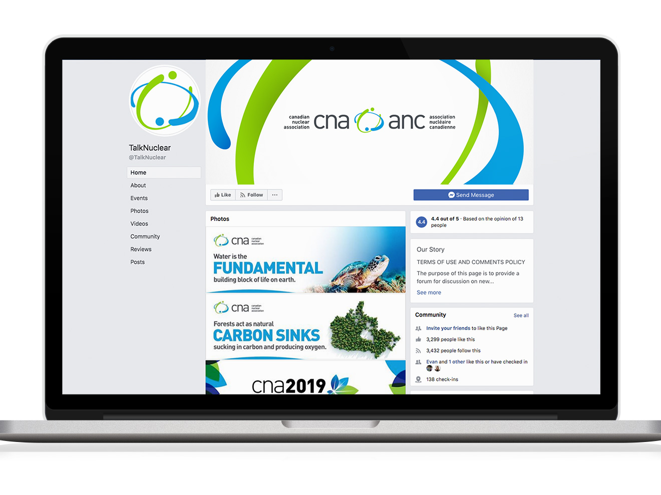
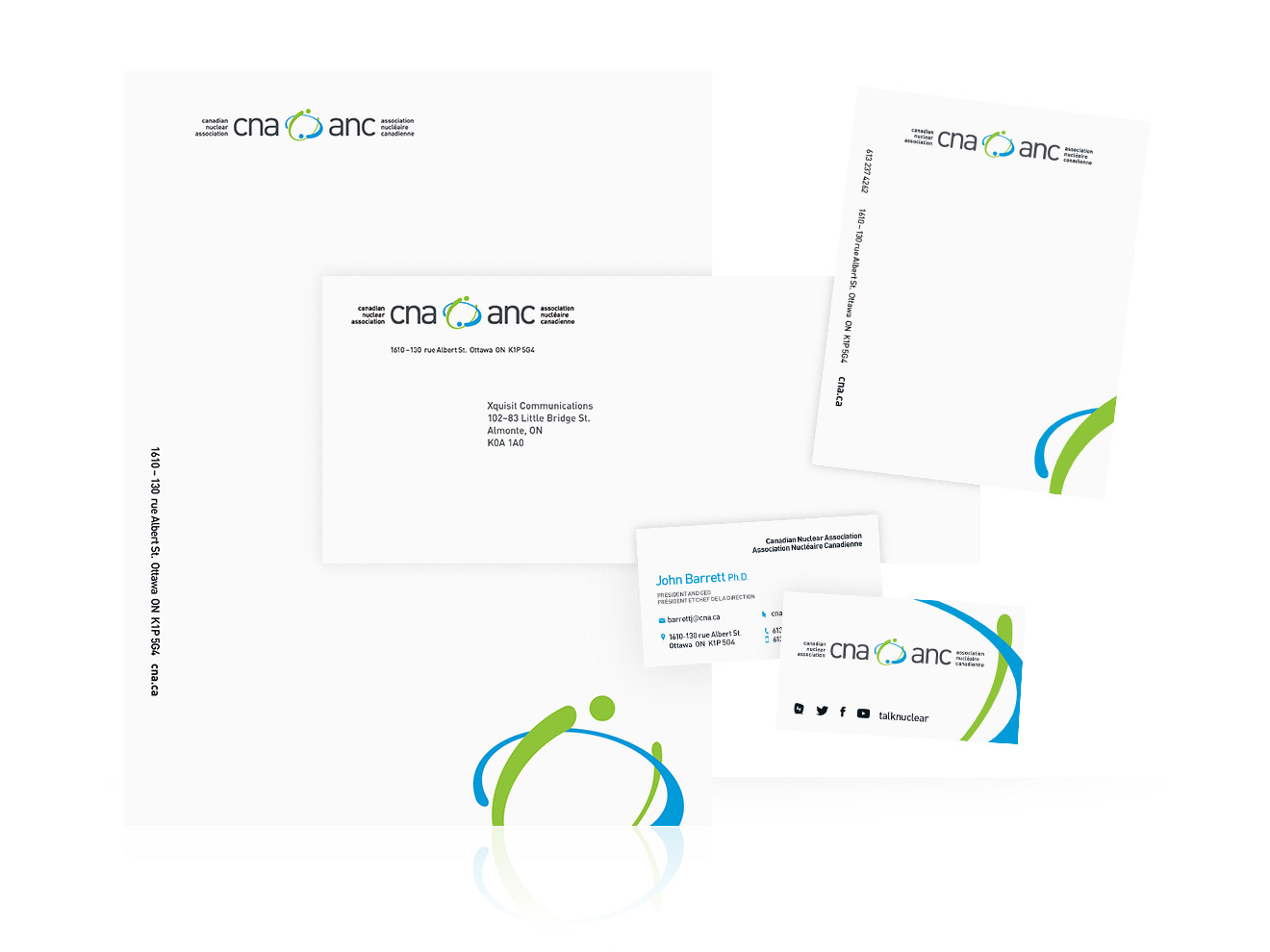
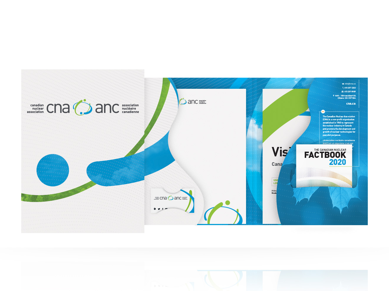
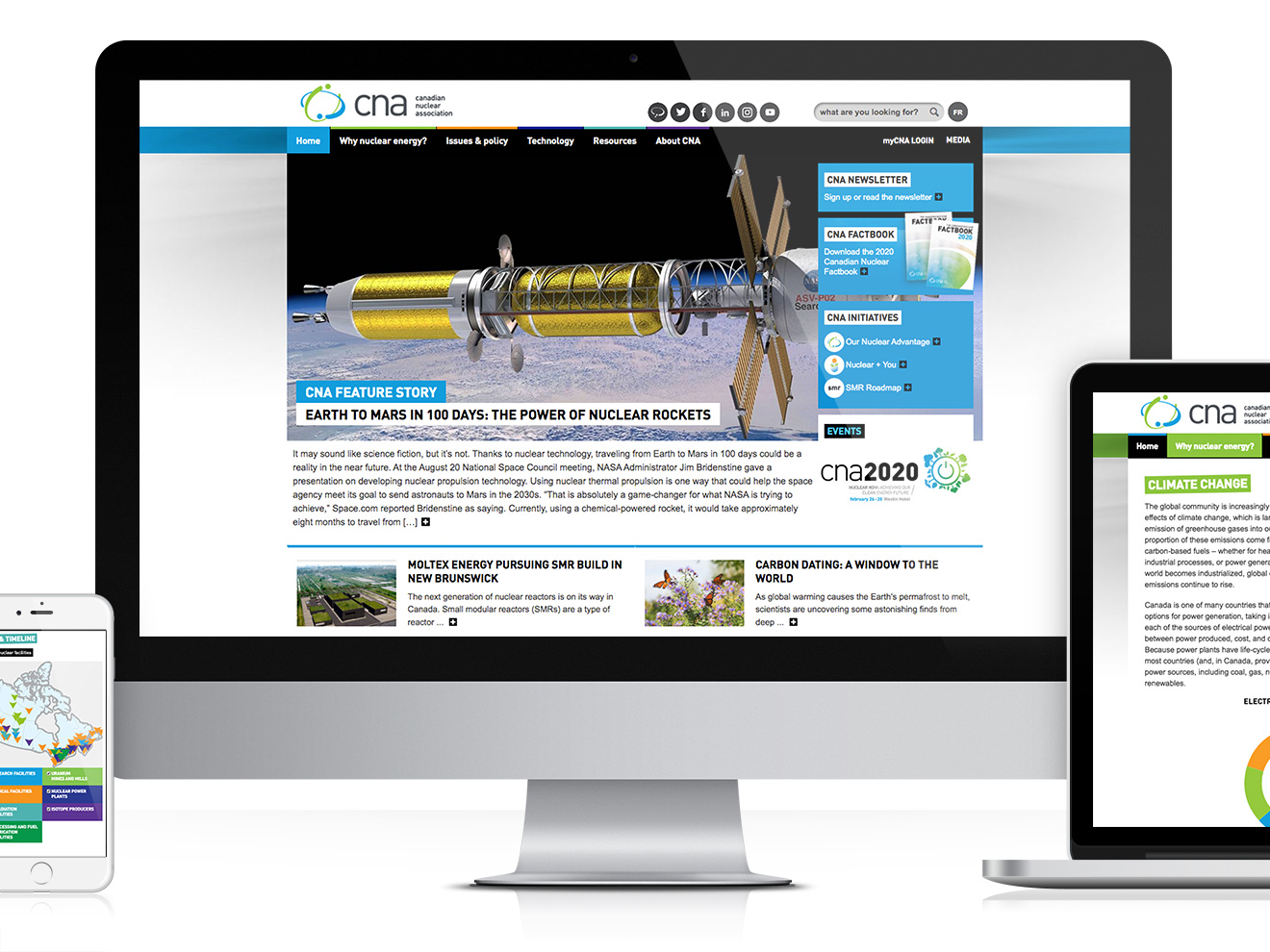
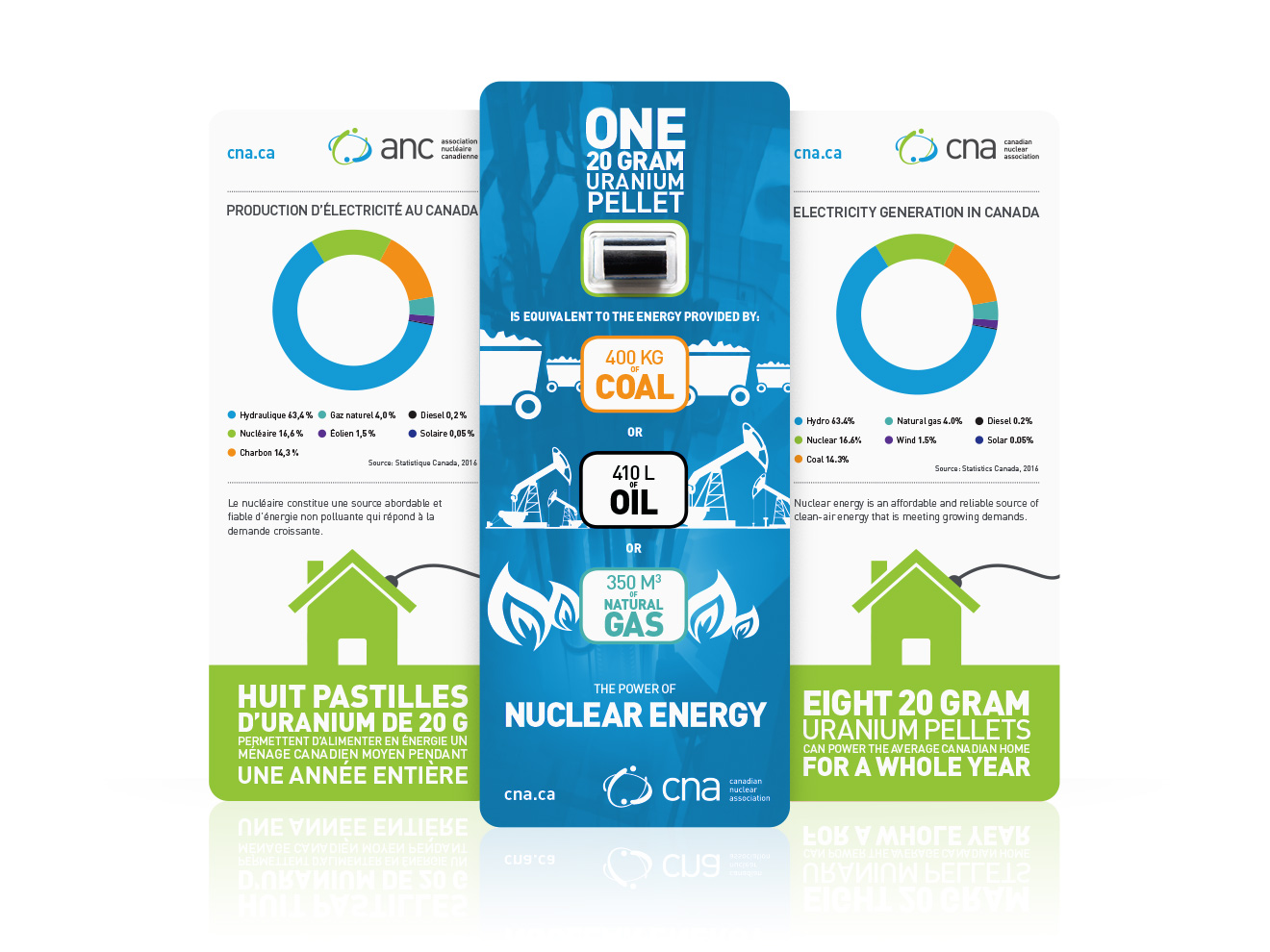
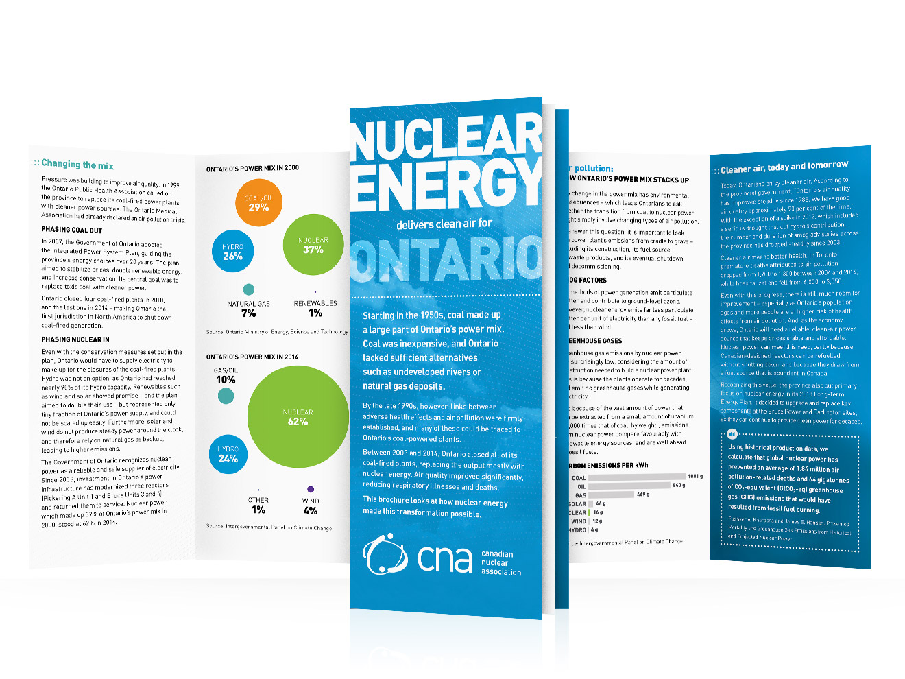
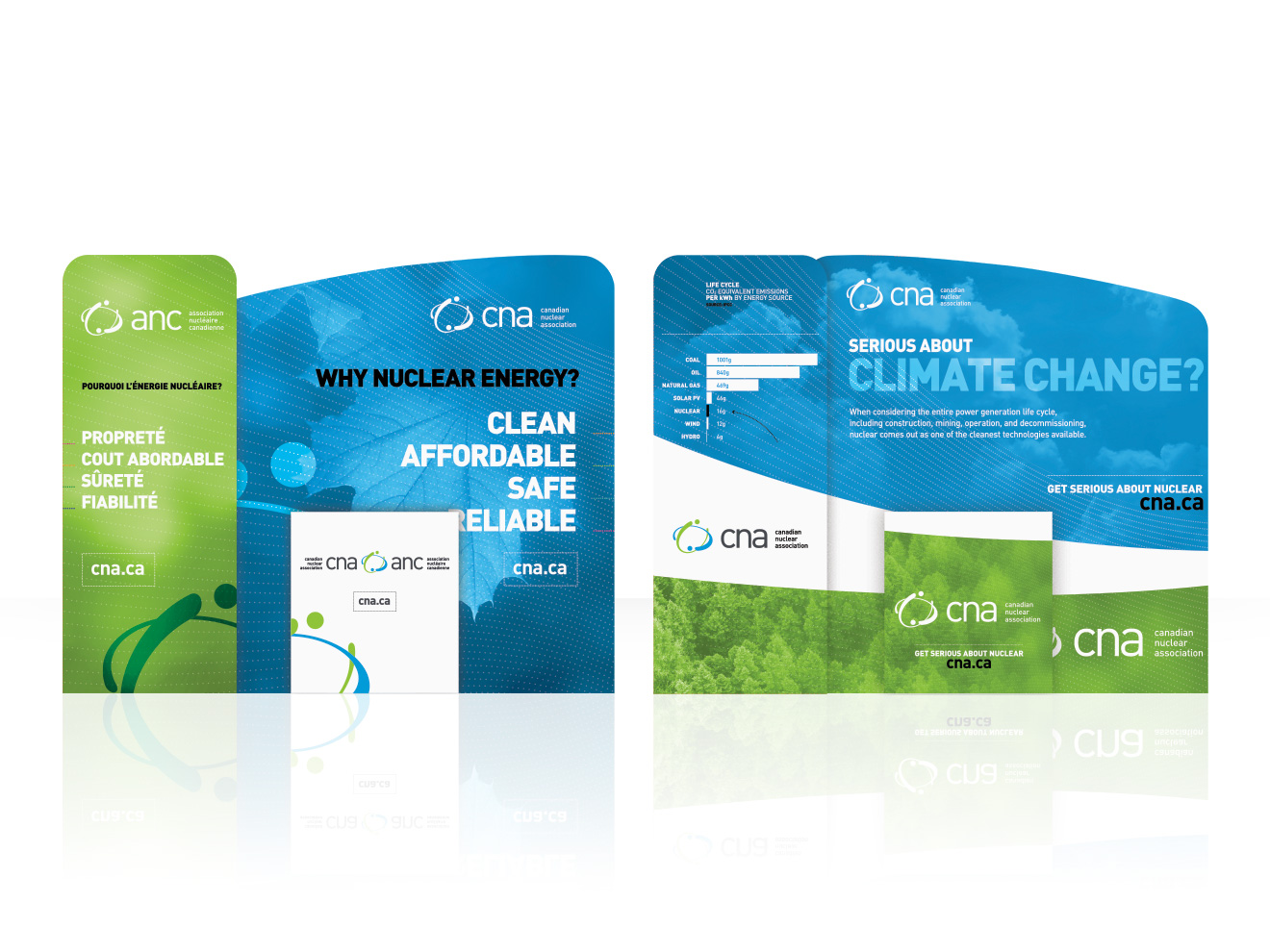
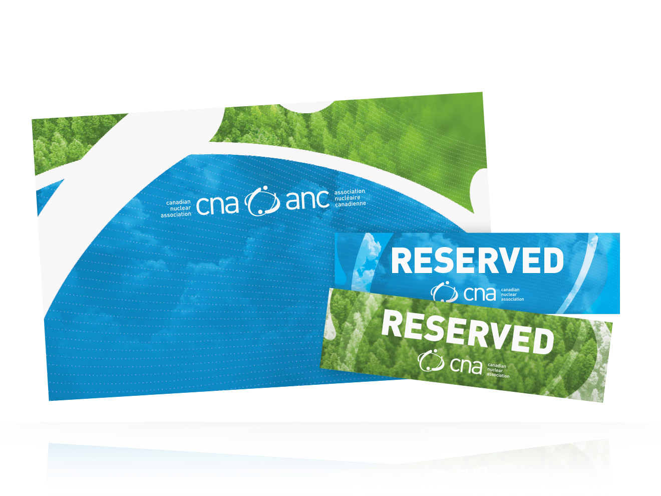
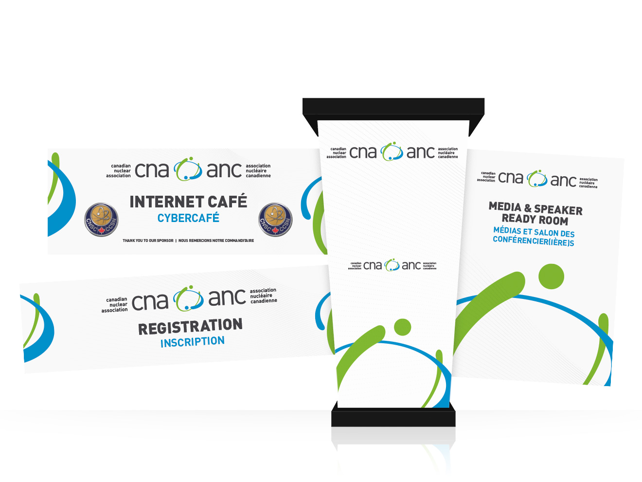
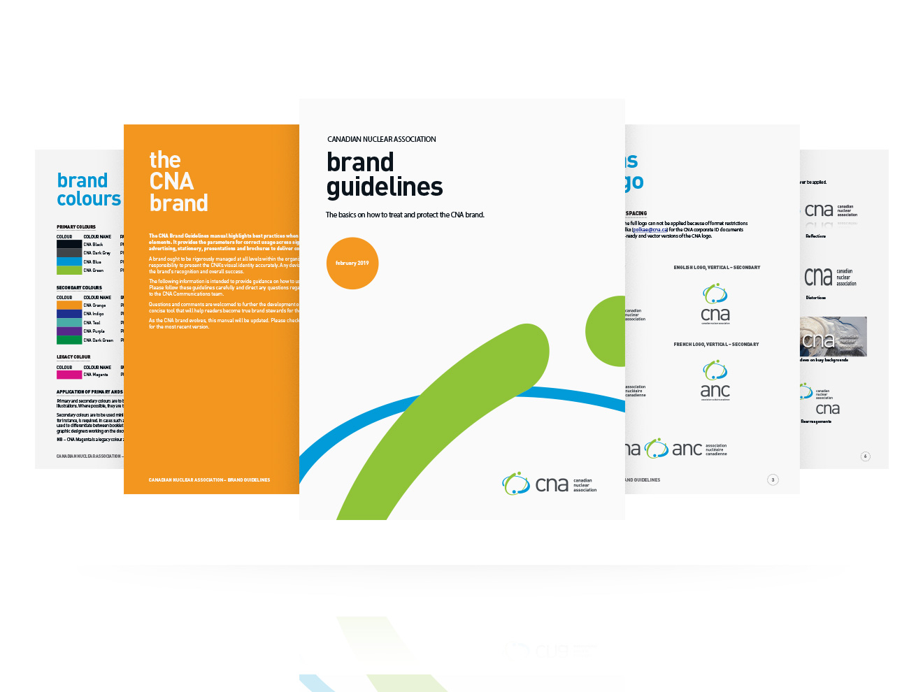
We developed a visual brand guideline document to inform use of their new identity to ensure consistency and professionalism across all corporate communications. Using the guidelines as a foundation, we designed their business cards, letterhead, kitfolder, membership booklet, pamphlets, flyers, and more. We refreshed their website and its numerous image assets, created branded infographics, charts and graphs, and produced a range of experiential collateral for CNA’s many hosted events; banners, posters, wayfinding graphics, roll-ups, and trade-show booths.
The materials communicate and strengthen CNA’s corporate objectives and create a strong brand affiliation across their collateral. The fresh, bright and engaging themes convey their relevance and communicate an industry that is clean, affordable, safe, and reliable.
Overall, CNA’s progressive new identity depicts them as a leader in the nuclear industry. Their new brand is engaging and professional, and their communications effectively promote the positive social, economic, and environmental benefits of nuclear, in Canada and around the world.