
// branding, identity
Bytown Public Affairs is a public relations, management and communications firm comprised of regulatory experts, scientists and public relations professionals. They specialize in life science, technology and consumer products companies, facilitating successful relations between the companies they represent and Canada’s regulatory system, political decision makers, and the media.
Upon founding, they needed to develop a corporate identity and visual brand. We wanted to convey their expertise and experience with a logo symbolizing strength and stability, and complementary of their namesake. Bytown being the founding name of the city of Ottawa, it made perfect sense to choose a motif actively associated with the region.

The Royal Alexandra Interprovincial Bridge is a steel truss cantilever bridge spanning the Ottawa River between downtown Ottawa and Gatineau. It embodies fortitude, endurance and connectivity; it was completed in 1900 and presently acts as an important link between Ontario and Quebec.
Using the bridge as the centrepiece of the design, the overall shape was broken down into basic geometric components and cropped to a small span of the bridge. Their name sits between two points, symbolic of the company’s objective to help connect and bridge entities together.
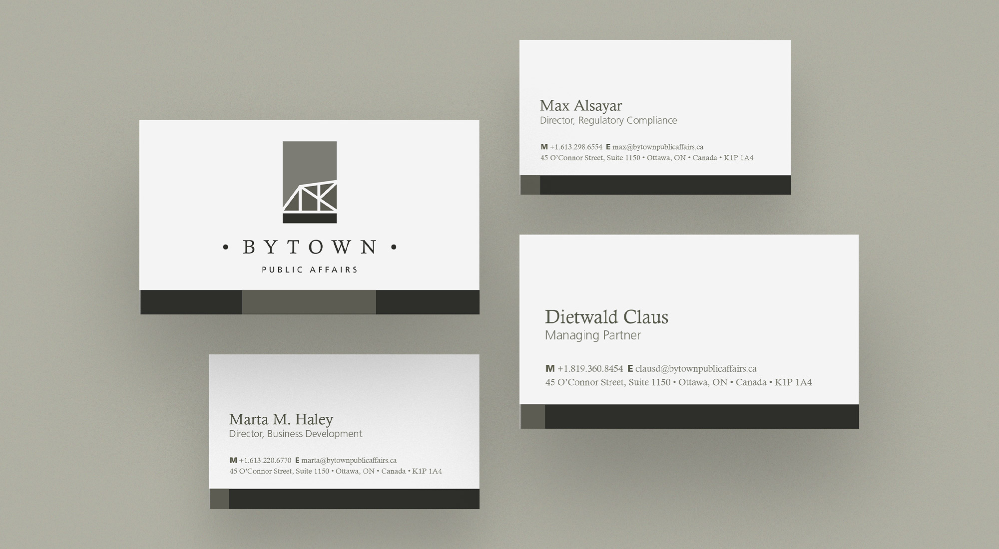
We developed a corporate colour palette by sampling from several sources; the truss of the bridge itself, the lamp poles, and the oxidized copper roofs of Parliament. We used their corporate colours in large blocks on their stationery to develop an identifying feature across their communications, forming a basis from which to build their visual brand.
Overall, the identity conveys connectivity and strength, effectively representing their corporate narrative and communicating professionalism, stability and longevity.