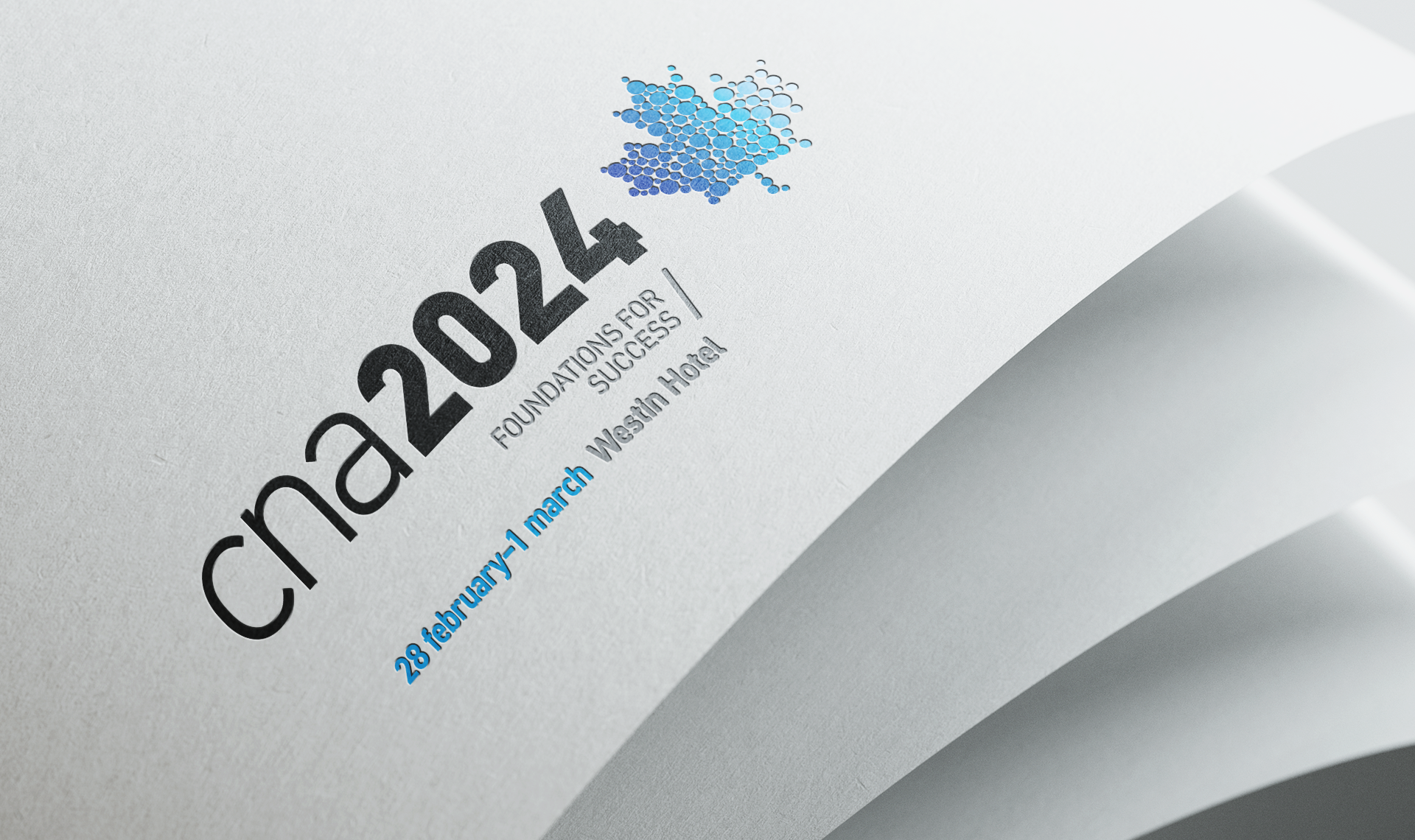
The Canadian Nuclear Association (CNA) hosts an annual conference that brings together professionals from across the nuclear industry. It provides an opportunity for engineers, leaders, and experts from a range of sectors to connect, exchange ideas, and expand their understanding of the industry’s advancements and future potential. In 2025, CNA introduced its first CAN West conference, an event modeled after the annual conference but tailored specifically to the nuclear sector in western Canada.
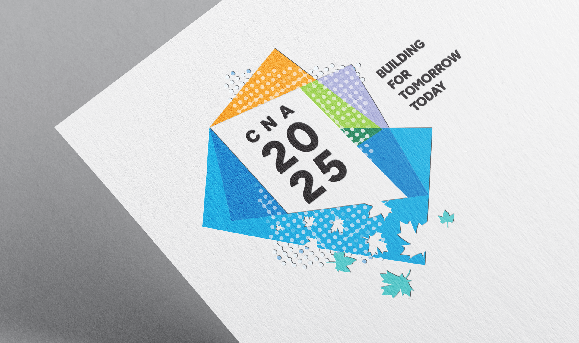
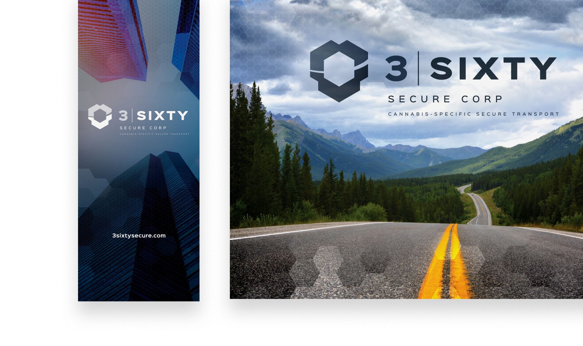
Each year, the conference requires a fresh visual identity that reflects its purpose and evolving vision. This identity captures the conference’s core values while setting the tone for meaningful dialogue and forward-looking collaboration. The branding extends across a wide range of conference collateral, creating a cohesive and recognizable experience throughout the event.

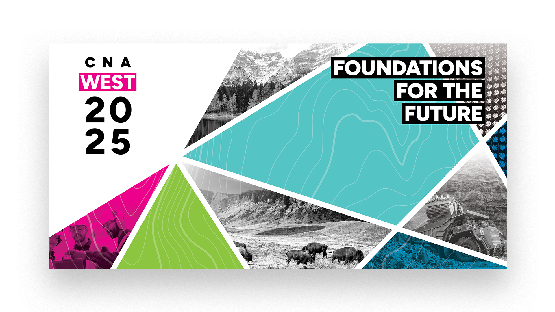
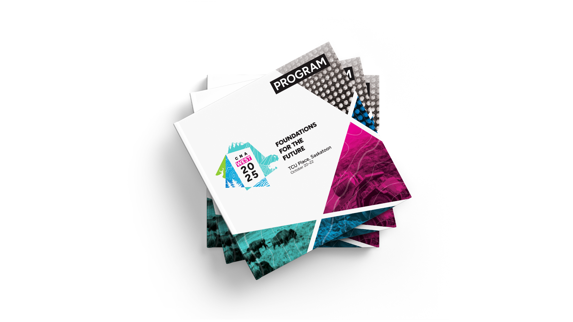
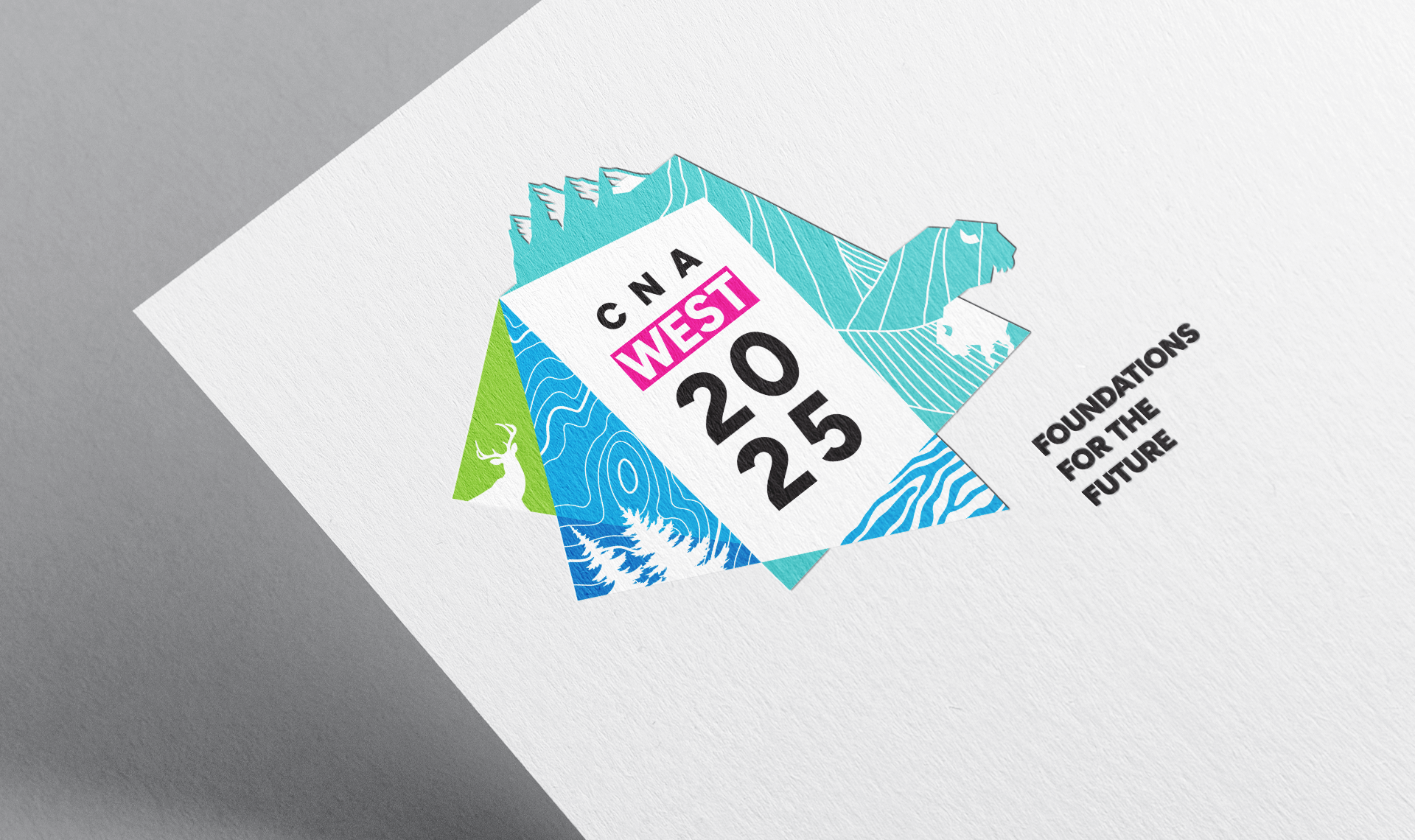
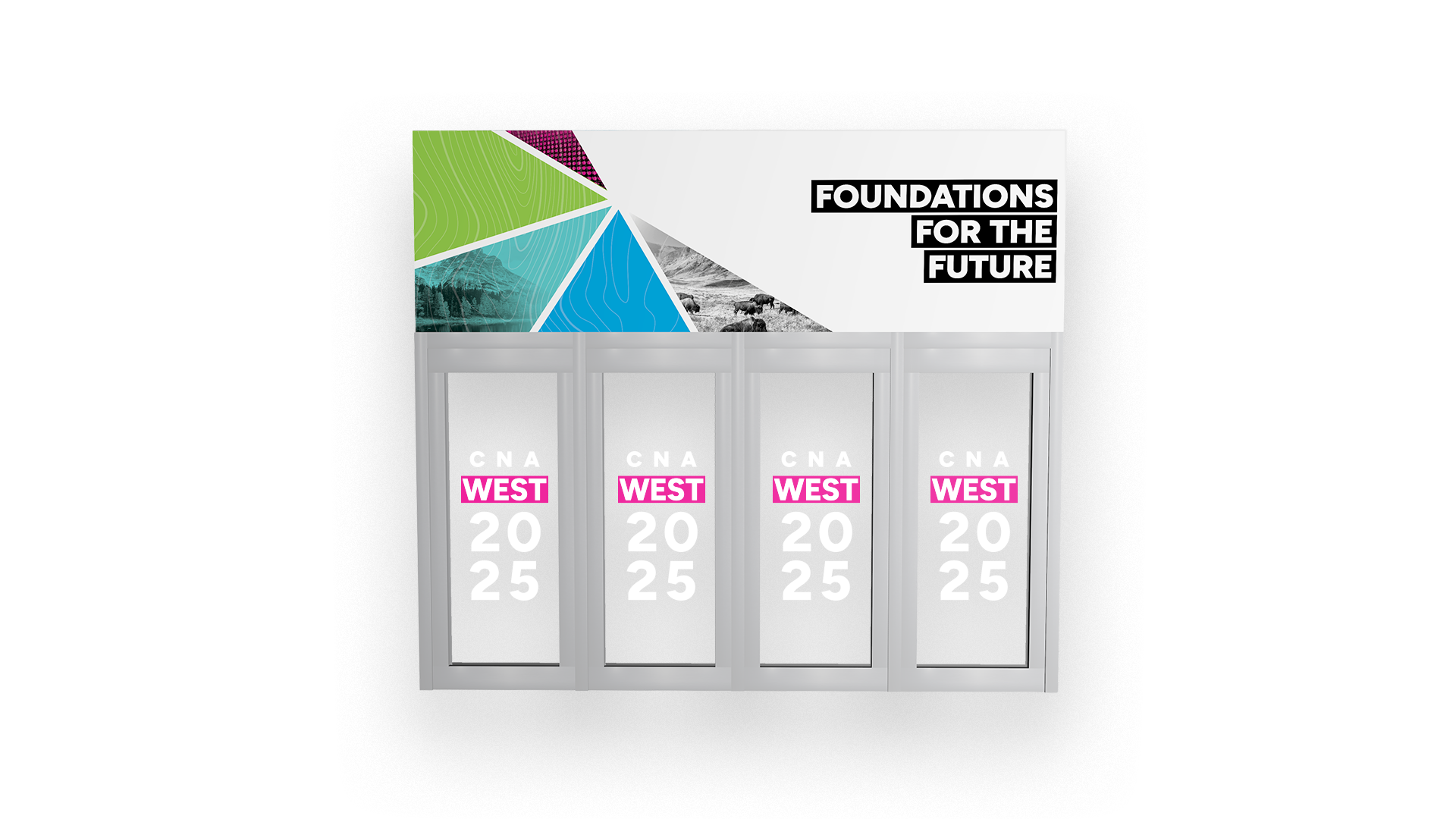
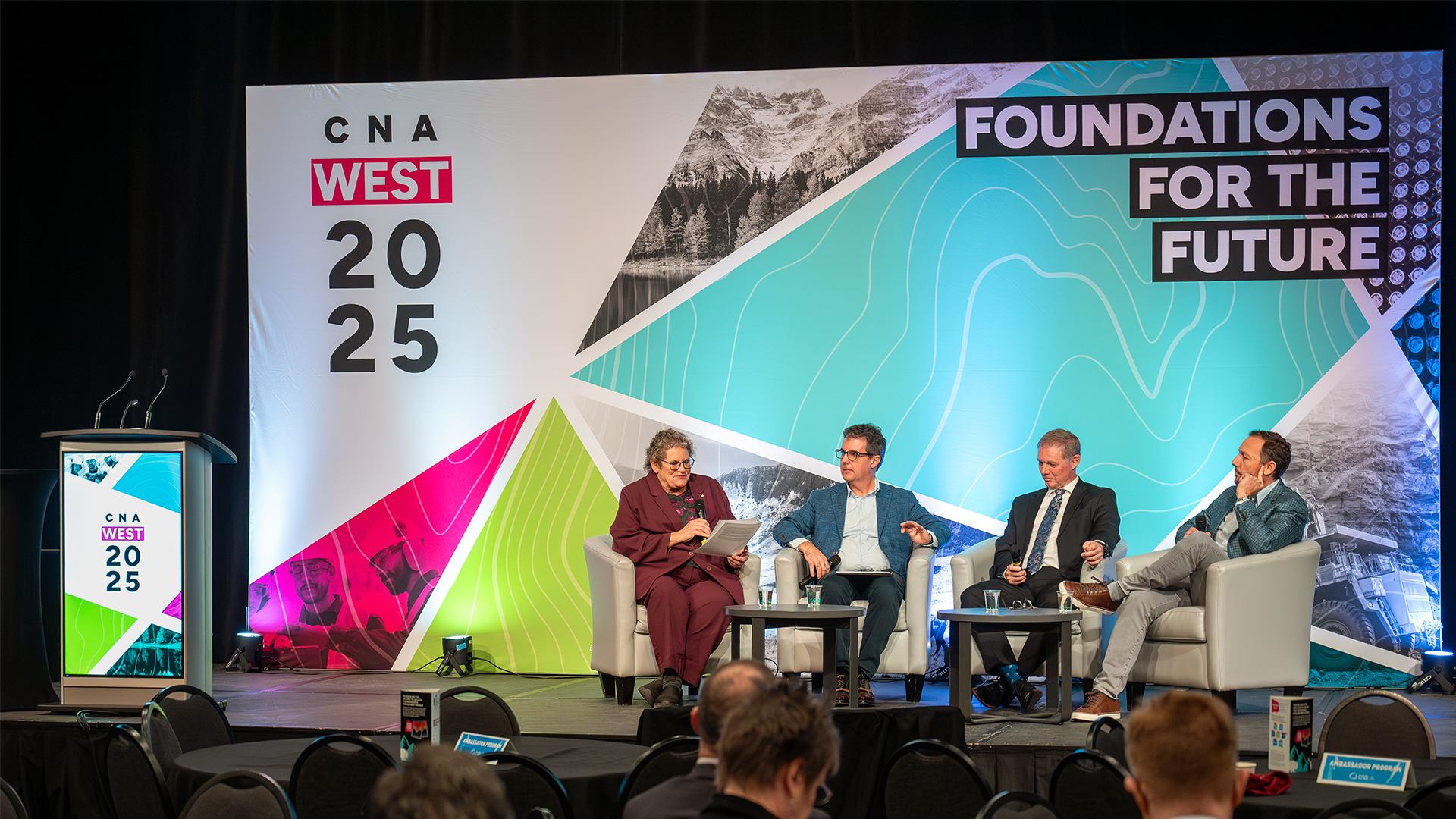
The design reflects innovation, energy, and a future-forward mindset through bold geometric shapes and contemporary styling. “CNA 2025” is prominently featured to reinforce the conference’s forward-looking focus, while “West” is highlighted in magenta to emphasize the western identity of this new event. Abstract forms suggest motion and momentum, symbolizing industry progress and subtly referencing topographical lines. Illustrations of bison, deer, trees, and mountains nod to the diverse landscapes and provinces of Western Canada. The result is a confident, approachable design that connects with a broad audience and captures the spirit of the conference.
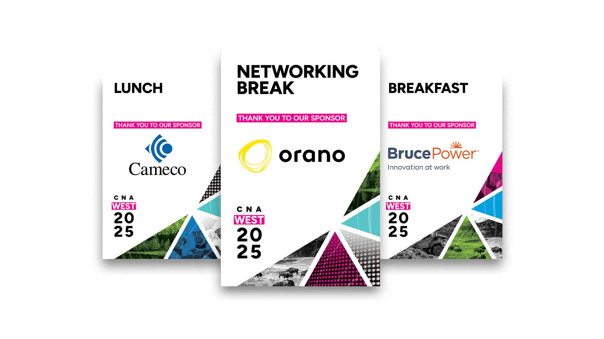
Conference collateral included welcome banners, sponsor signage, programs, a stage backdrop, door decals, and more. Each piece reinforces the visual identity, creating an elevated and dynamic experience throughout the event. Black-and-white imagery balances the vibrant colour palette, while the topographical motif adds texture and movement. Colour and imagery shift within the angular shapes, establishing a dynamic yet structured rhythm. Highlighted logo text appears across signage, further strengthening brand recognition. Together, these elements create a confident, memorable conference look that leaves a lasting impression.
We are located in beautiful Almonte, just west of Ottawa. Join us in our sunny office, or we’ll be happy to meet at yours.
Do you have a project in mind and would like to get a detailed quote?
We can’t wait to hear from you!
Just want to get in touch with us? Send us a note!