Cannasalc is a business-to-business logistics firm specializing in commercial cannabis storage, shipping, and security. As Canada’s cannabis industry rapidly expands, firms like Cannasalc must stand out in a crowded market. Their services meet a growing need for secure, reliable logistics tailored to cannabis. This niche demands transport expertise and strict regulatory compliance. Cannasalc plays a vital role in ensuring products reach destinations safely and compliantly.
Recognizing this position, Cannasalc saw brand identity as more than visuals. It was a strategic chance to shape how the company is perceived by clients, regulators, and partners. The cannabis sector often suffers from stereotypes that can undermine professionalism. The goal was to build a brand that signals corporate credibility, forward-thinking values, and dependability—instilling confidence across the entire supply chain.

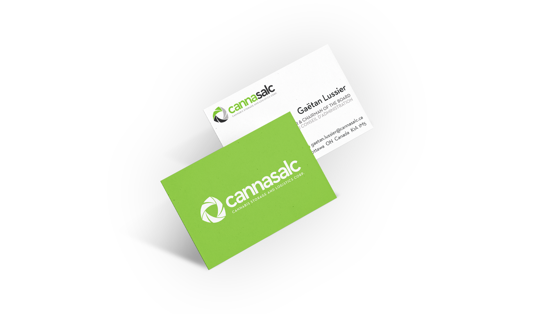


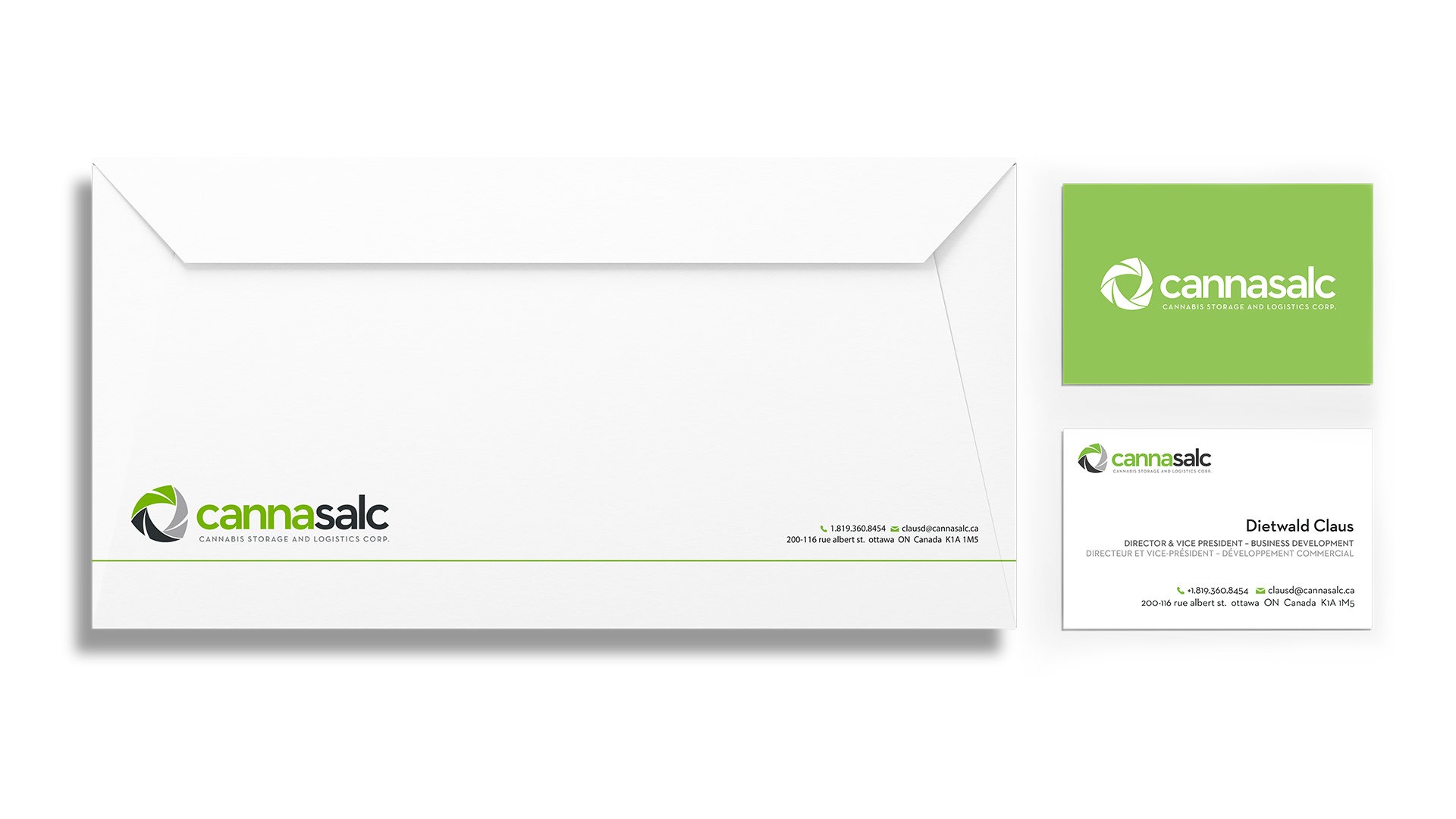
The design strategy centred on three core themes: transportation, security, and progress. Dynamic arcs, a contained shield, and modern shapes symbolize the company’s forward momentum and evolving industry role. Neutraface Text complements the linear geometry of the icon and enhances the design’s clarity and modernity. The Cannasalc brand identity design visually represents strength, protection, and innovation.
The shield shape anchors the design, emphasizing security and trust—essential traits for a logistics company handling sensitive products. The arcs suggest motion and growth, reinforcing Cannasalc’s commitment to progress and adaptability. This approach ensures the identity stands apart from competitors relying on clichéd imagery.
With a strong foundation and years of experience, Cannasalc’s new identity positions the company as a leader in Canadian commercial cannabis logistics. The Cannasalc brand identity design speaks to clients seeking professionalism, security, and innovation. Cutting through the noise, this identity strikes a balance between sophistication and reliability, aligning with Cannasalc’s mission and story.
We are located in beautiful Almonte, just west of Ottawa. Join us in our sunny office, or we’ll be happy to meet at yours.
Do you have a project in mind and would like to get a detailed quote?
We can’t wait to hear from you!
Just want to get in touch with us? Send us a note!